<?xml version="1.0" encoding="utf-8"?><feed xmlns="http://www.w3.org/2005/Atom" ><generator uri="https://jekyllrb.com/" version="3.9.5">Jekyll</generator><link href="https://davidfirth.github.io/blog/feed.xml" rel="self" type="application/atom+xml" /><link href="https://davidfirth.github.io/blog/" rel="alternate" type="text/html" /><updated>2024-06-17T08:39:57+00:00</updated><id>https://davidfirth.github.io/blog/feed.xml</id><title type="html">Let’s Look at The Figures</title><subtitle>David Firth's occasional blog about statistics</subtitle><author><name>David Firth</name></author><entry><title type="html">My best known work, fading citations and a bit of history</title><link href="https://davidfirth.github.io/blog/2023/01/05/f93-citations-and-history/" rel="alternate" type="text/html" title="My best known work, fading citations and a bit of history" /><published>2023-01-05T00:00:00+00:00</published><updated>2023-01-05T00:00:00+00:00</updated><id>https://davidfirth.github.io/blog/2023/01/05/f93-citations-and-history</id><content type="html" xml:base="https://davidfirth.github.io/blog/2023/01/05/f93-citations-and-history/"><![CDATA[<p><em>This will be the second egocentric post in succession — for which, apologies in advance!  (It’s a sign of age, I suspect.)</em></p>

<p>This year will see the 30th anniversary of the publication of my most-cited research paper, which developed a general method for bias reduction of maximum likelihood estimates.  I’ll write a few notes below (section 2) about the paper’s history.  But first, to the main reason for this blog post: something that seems odd in the recent citation data.</p>

<h1 id="1-why-does-citation-growth-seem-to-be-slowing">1. Why does citation growth seem to be slowing?</h1>

<p>Here is today’s view of the paper in <em>Google Scholar</em>:</p>

<p><a href="/blog/assets/media/2023/01/scholar_screenshot.png"><img src="/blog/assets/media/2023/01/scholar_screenshot.png?w=278" alt="scholar-screenshot" /></a></p>

<p>The graph there indicates that my 1993 paper is still cited — Google Scholar shows a steadily increasing annual count, reaching 494 citations in calendar year 2021. The count shown for 2022 is currently 491 citations, and I suppose that that figure might grow a bit in the early days of 2023 as Google Scholar catches up.  But it does look as though the growth in citations is slowing down a bit.</p>

<p>Why does this seem odd?  Well, I know from interacting with other researchers (at conferences for example) that usage of the method from my 1993 paper is still on the increase, as is the <em>range</em> of research disciplines in which it gets used.  So the puzzle is: why does the <em>Google Scholar</em> citation count no longer seem to show sustained growth in the method’s use?</p>

<p>At one recent conference I attended, I met someone who told me that “Firth logistic regression” (as they called it) is now so standard in their field (a particular branch of medical research) that it often gets used <em>without</em> any explicit reference to my published work. For example, a published research article might say something like “we used Firth’s logistic regression” but then not cite my 1993 paper as the source of that method.</p>

<p>If that’s the reality, then I suppose I ought to be happy about it. I am guessing that the use of (for example) “Fisher information” and “Cox proportional hazards model” — each of which is often seen without reference to the source (Fisher 1925 or Cox 1972 respectively) — did not make Fisher or Cox very unhappy. If it turns out that I have published something in remotely the same league as those things — even if it’s in one of the lower divisions of the league! — then I should not be at all bothered about citation counts.</p>

<p>To see if there is any concrete evidence for what I had been told at the recent conference, I took a quick look today at the data for the current year, 2023. It’s actually only the 5th day of 2023 today, so there is not too much data — a big advantage!  (While more data would likely yield a more reliable analysis, the fact is that much more data would have taken much more time to process, and that would have been prohibitive for me.)</p>

<h3 id="the-2023-data-as-at-5-january">The 2023 data, as at 5 January</h3>
<p>Google Scholar records 7 citations of my 1993 paper so far, in the first 5 days of 2023.</p>

<p>But a Google Scholar search for any papers whose text includes the words “Firth” and “logistic” finds 10 papers published in 2023 to date. All ten of those papers do indeed use the method that was developed in my 1993 paper.  But only two of the ten papers actually contain a citation to my published work (they both cite the 1993 paper, so they are included among the 7 mentioned above). The remaining eight papers are “non-citing”: they all describe their use of “Firth’s logistic regression” or “logistic regression with the Firth procedure” or suchlike, but with no reference provided to the published source of the method.</p>

<p>(The ten papers that were found in the just-mentioned search are listed here in <a href="/blog/assets/media/2023/01/search-results.txt">search-results.txt</a>, in case anyone is interested!)</p>

<p>To sum up this little data-collection exercise, then:</p>
<ul>
  <li>in total fifteen distinct papers were found that used my method;</li>
  <li>seven of them cited my 1993 paper, and eight did not.</li>
</ul>

<h3 id="conclusion">Conclusion?</h3>

<p>It’s a tiny amount of data that I have looked at here, but seemingly already enough to confirm what I had heard anecdotally at the recent conference: there appears to be plenty of published research that uses the method from my 1993 paper but without citing its source.  Indeed the evidence just presented, small as it is, suggests that non-citations possibly outnumber formal citations at present.</p>

<p>There could perhaps be an interesting project for a data-science student in all this? For example, to look at citations of the famous Cox 1972 paper and the extent to which formal citation gets <em>replaced</em> by bare phrases such as “Cox proportional hazards model” or “Cox regression” or just “Cox model”. Such a project would demand/develop substantial skill in text processing, I think, and it might present some difficulties in terms of automated access to published works.  But it could perhaps reveal some interesting patterns? (and similar patterns might even be found in other disciplines too?)</p>

<h1 id="2-a-bit-of-history">2. A bit of history</h1>

<p>While writing the above I was reminded of various things connected with that 1993 paper.  I’ll make a few notes here on some of them, in case anyone is interested.</p>

<h3 id="actually-written-in-1991">Actually written in 1991</h3>

<p>This I remember vividly.  In May 1991 our first child was born; and her arrival was energising as well as exhausting.  I wrote “Bias reduction of maximum likelihood estimates” in the late spring and summer of 1991. I think the sleep-deprived nights in that period might have caused me to think differently about things; I doubt that I would normally have had the confidence to write such a paper, at such speed. (I am normally very, very slow!)  Our newly arrived daughter cartainly inspired me to finish the work and submit it to <em>Biometrika</em> for publication, by the end of the summer.</p>

<p>And then the paper was rejected, quite quickly as I recall (a “desk rejection”).  The Associate Editor did not like it.  The reason was that my paper had some superficial similarities with other work from the 1980s and early 1990s, work on “modified profile likelihood” methods for eliminating nuisance parameters in statistical models.  I knew about those things, and had deliberately steered away from writing about them in my paper. My paper was an altogether more modest piece of work than the hugely impressive modified profile likelihood literature, and it could in no way be viewed as an alternative to all that. To me this was absolutely clear: the notion of bias is <em>not even invariant to re-parameterization of the model</em>, after all.  But the Associate Editor seemed not to appreciate this, and so the paper was rejected.</p>

<p>Rejection led to dejection, and for some time afterwards I left the paper in a drawer untouched.  But eventually I did something that I would not normally do: I wrote humbly to the Editor of <em>Biometrika</em> to ask them to reconsider.  I knew that my paper was as good as anything I could ever produce; and I also knew that <em>Biometrika</em> was where I wanted my best work to appear.  Fortunately, the Editor understood the point about bias and reparameterization, and I was permitted to submit a revised version of the paper that clarified the relationship with modified profile likelihood.  That second version was enough, thankfully, to persuade the Associate Editor to recommend acceptance of the paper — but only after a further revision to <em>remove</em> the parts that I had added about the (non-)relationship with modified profile likelihood.  The paper eventually appeared in the journal about 18 months after it was first submitted.</p>

<h3 id="roots-potatoes">Roots: potatoes!</h3>

<p>The idea for the paper came out of a coffee-time question that I had been asked by Sue Lewis, who was my colleague at Southampton and an expert on design of experiments.  Sue was doing some consulting work with a company (Dalgety PLC), who had conducted a small experiment relating to the storage of potatoes. The problem was that their logistic regression analysis (performed in <em>GLIM</em>) had produced some enormous parameter estimates and standard errors, and their question to me was whether there was something wrong with the design of the experiment. I was interested, and found that the problem was not with the design but with the analysis: the well-known phenomenon of <em>separation</em> was causing maximum likelihood estimates to be “at infinity”.  This led me to think about penalizing the likelihood to avoid the “estimates at infinity” problem; and then I made a connection with bias reduction, which led to the more general method that was developed in the paper.</p>

<p>I never actually wrote anything about the potato experiment, unfortunately.  Several years later, though, the same dataset — with analysis by my method — appeared in a nice paper that Sue Lewis published with other members of her experimental-design group.  It’s the “potato packing example” in their 2006 paper:</p>
<blockquote>
  <p>Woods, DC, Lewis SM, Eccleston, JA &amp; Russell, KG (2006). Designs for generalized linear models with several variables and model uncertainty. <a href="https://doi.org/10.1198/004017005000000571">Technometrics, 48(2), 284–292</a>.</p>
</blockquote>

<p>[<strong>A note for younger readers:</strong> <em>GLIM</em> was ground-breaking software, first developed in the 1970s under the leadership of J A Nelder and sponsored by the Royal Statistical Society.  It was the first “object-oriented” system for interactive statistical modelling, and it led to a revolution in statistical practice. Today’s <code class="language-plaintext highlighter-rouge">glm()</code> and other such modelling functions in <em>R</em>, for example, are direct descendants of <em>GLIM</em>.]</p>

<h3 id="surprisingly-wide-reach">Surprisingly wide reach?</h3>

<p>The paper went largely unnoticed for about 10 years after its publication. But then it started to be used across a fairly broad array of research disciplines. This was largely due, I think, to the appearance in 2002 of an influential <em>Statistics in Medicine</em> paper by G Heinze and M Schemper from the University of Vienna — and due especially to their having published widely useable <em>software</em> to accompany their paper.</p>
<blockquote>
  <p>Heinze, G &amp; Schemper, M (2002). A solution to the problem of separation in logistic regression. <a href="https://doi.org/10.1002/sim.1047">Statistics in Medicine, 21(16), 2409–2419</a>.</p>
</blockquote>

<p>Papers in similar vein appeared also in some other disciplines. A notable example is this 2005 <em>Political Analysis</em> article by C Zorn:</p>
<blockquote>
  <p>Zorn, C (2005). A solution to separation in binary response models. <a href="https://doi.org/10.1093/pan/mpi009">Political Analysis, 13(2), 157–170</a>.</p>
</blockquote>

<p>By 2012 my paper was being cited more than 100 times per year, which was both pleasing and unexpected.  In 2013 I made a poster, for a departmental event at Warwick to showcase the applied impact of Statistics research.  The poster (PDF available via the thumbnail link below) gave examples of several research fields in which the method from my paper had been used.</p>

<p><a href="/blog/assets/media/2023/01/Firth1993-citations-poster-2013.pdf"><center><img src="/blog/assets/media/2023/01/poster-for-web.png" width="40%" title="Open the PDF file for this poster" alt="thumbnail link to PDF poster" /></center></a></p>

<p>(The subliminal bar chart in the poster shows the <em>Google Scholar</em> citation counts for years 1994 to 2012.)</p>

<p>Most of the applications seen in other disciplines have been in the context of binary and multi-category regression models, especially logistic regression and multinomial-logit models.  This is unsurprising, given the existence of accessible works of advocacy such as the papers by Heinze &amp; Schemper (2002) and by Zorn (2005), mentioned above.  In addition, logistic regressions (and similar) are a win-win context for estimation via the maximum penalized likelihood method of my paper.  Finite estimates are guaranteed; and importantly, bias reduction is always accompanied in such contexts by variance reduction — so there is <em>no trade-off</em> between bias and variance.  These features of the method had been known about for several years through empirical studies and informal arguments, and they are established more systematically in a relatively recent paper written jointly with Ioannis Kosmidis.</p>

<blockquote>
  <p>Kosmidis, I &amp; Firth, D (2021). Jeffreys-prior penalty, finiteness and shrinkage in binomial-response generalized linear models. <a href="https://doi.org/10.1093/biomet/asaa052">Biometrika, 108(1), 71–82</a>.</p>
</blockquote>

<p>And that brings us nicely back to citations.  Of the “non-citing” publications, i.e., papers that use my 1993 method but don’t cite the 1993 paper, most (perhaps all?) are applications of logistic regression for binary-response data.  And nowadays such applications really <em>should</em> be citing the newer work Kosmidis &amp; Firth (2021).  These things only happen very slowly of course, if at all.  I’m not going to hold my breath…</p>

<hr />

<p>© David Firth, January 2023</p>

<p><strong>To cite this entry:</strong>
Firth, D (2023).  My best known work, fading citations and a bit of history.  Weblog entry at URL
<a href="/blog/2023/01/05/f93-citations-and-history/">https://DavidFirth.github.io/blog/2023/01/05/f93-citations-and-history/</a></p>]]></content><author><name>David Firth</name></author><category term="Citations" /><summary type="html"><![CDATA[This will be the second egocentric post in succession — for which, apologies in advance! (It’s a sign of age, I suspect.)]]></summary></entry><entry><title type="html">My academic ancestry: Cox,Daniels,,,,,,,,,,,,,Newton,,,Galileo!</title><link href="https://davidfirth.github.io/blog/2022/04/11/cox-newton-galileo/" rel="alternate" type="text/html" title="My academic ancestry: Cox,Daniels,,,,,,,,,,,,,Newton,,,Galileo!" /><published>2022-04-11T00:00:00+00:00</published><updated>2022-04-11T00:00:00+00:00</updated><id>https://davidfirth.github.io/blog/2022/04/11/cox-newton-galileo</id><content type="html" xml:base="https://davidfirth.github.io/blog/2022/04/11/cox-newton-galileo/"><![CDATA[<p>Recently I wrote <a href="https://rss.onlinelibrary.wiley.com/doi/epdf/10.1111/1740-9713.01632">a short article</a> in memory of David Cox, who died in January aged 97. David had been my PhD adviser (at Imperial College London in the 1980s) and we became good friends.</p>

<p>While writing that article I discovered the magic of the online <a href="https://genealogy.math.ndsu.nodak.edu/">Mathematics Genealogy Project</a> (MGP).  And, in particular, I discovered that through David Cox I am a direct descendant of Isaac Newton and also of Galileo Galilei!</p>

<p>It seems that Galileo, whose doctorate was completed in Pisa in 1585, remarkably has more than 30,000 known academic descendants — so I must have a lot of academic cousins out there.</p>

<p>Ancestry in the MGP is traced through the relationship of PhD supervisor and student.  David Cox was my academic father, Henry Daniels my grandfather, etc. Thirteen generations before Daniels we find Isaac Newton (Cambridge, 1668) and three generations before that is Galileo Galilei (Pisa, 1585).</p>]]></content><author><name>David Firth</name></author><summary type="html"><![CDATA[Recently I wrote a short article in memory of David Cox, who died in January aged 97. David had been my PhD adviser (at Imperial College London in the 1980s) and we became good friends.]]></summary></entry><entry><title type="html">This blog has now moved to GitHub</title><link href="https://davidfirth.github.io/blog/2021/09/10/moved-to-github/" rel="alternate" type="text/html" title="This blog has now moved to GitHub" /><published>2021-09-10T00:00:00+00:00</published><updated>2021-09-10T00:00:00+00:00</updated><id>https://davidfirth.github.io/blog/2021/09/10/moved-to-github</id><content type="html" xml:base="https://davidfirth.github.io/blog/2021/09/10/moved-to-github/"><![CDATA[<p>After about 10 years of being hosted at wordpress.com, my personal blog “Let’s Look at the Figures” is now moving to GitHub.  The reasons are various, including:</p>

<ul>
  <li>I am already using <em>Jekyll</em> with <em>GitHub Pages</em> for my other blog at <a href="https://alt-3.uk">alt-3.uk</a> (about maths and football leagues) — and I like it! The simplicity of static pages maintained through a collection of plain-text files is very appealing to me.</li>
  <li>It is part of an effort to simplify my digital life, which has become overwhelmingly complicated in recent years.</li>
</ul>

<p>The stable URL has now changed to <a href="https://DavidFirth.github.io/blog">DavidFirth.github.io/blog</a>.</p>

<p>Some things that broke or are changed:</p>

<ul>
  <li>The previous domain name <em>statgeek.net</em> will soon cease to work. I can only apologise for any inconvenience that this causes to anyone. My recent retirement from paid work means that, while it’s nice to have a custom domain for my blog, I can no longer thoil it.</li>
  <li>All comments made on old blog posts via wordpress.com are being left behind — they are not being copied across to GitHub with the old blog posts. Likely that would be possible, but it does not seem easy.  Those old posts and comments will still be viewable at <a href="https://statgeek.wordpress.com">statgeek.wordpress.com</a>, for a while at least.</li>
  <li>From now on, commenting will not be available directly on blog entries themselves. I was getting a lot of spam comments, which was a pain. In future I will encourage people to comment/discuss posts with me on Twitter or by email, instead.</li>
</ul>

<p>For now, the new blog site at <a href="https://DavidFirth.github.io/blog">DavidFirth.github.io/blog</a> is rather “bare bones”.  It is likely to stay that way; but I am of course open to suggestions for improvement!</p>]]></content><author><name>David Firth</name></author><summary type="html"><![CDATA[After about 10 years of being hosted at wordpress.com, my personal blog “Let’s Look at the Figures” is now moving to GitHub. The reasons are various, including:]]></summary></entry><entry><title type="html">Why we should trust the exit poll — but not too much!</title><link href="https://davidfirth.github.io/blog/2019/12/09/why-we-should-trust-the-exit-poll-but-not-too-much/" rel="alternate" type="text/html" title="Why we should trust the exit poll — but not too much!" /><published>2019-12-09T00:00:00+00:00</published><updated>2019-12-09T00:00:00+00:00</updated><id>https://davidfirth.github.io/blog/2019/12/09/why-we-should-trust-the-exit-poll-but-not-too-much</id><content type="html" xml:base="https://davidfirth.github.io/blog/2019/12/09/why-we-should-trust-the-exit-poll-but-not-too-much/"><![CDATA[<p>I look ahead a few days here, to 10pm on UK General Election day. Polling stations will have just closed, and major broadcasters (BBC, ITV and Sky) will simultaneously announce the findings of their jointly-commissioned exit poll — the headline being always the predicted number of seats for the (predicted) largest party in the newly elected House of Commons.</p>

<p>The exit poll is by now a big part of election day/night. The expense of it is justified by the fact that the broadcasters get their alltime largest current-affairs viewing, listening and website-visiting figures during the first couple of hours after polls close on a General Election night — but in that <em>specific</em> couple of hours, almost all of the votes remain uncounted still. So the broadcasters need something for TV/radio/web commentators and on-air politicians to talk about in that first couple of hours; and the exit poll is a major part of that.</p>

<p>The world’s financial markets take notice of the exit poll too — in a big way, as evidenced by the substantial movements usually seen moments after 10pm on election day in currency rates and other markets.</p>

<p><strong>But how accurate is the exit poll?</strong></p>

<p>The answer since 2005 has mostly been: very accurate indeed! The 2005 General Election saw the full-scale introduction of a completely new set of methods for designing and analysing a UK exit poll — methods that had been tested first by the BBC at the 2001 election, and found to work so well that they were adopted jointly by BBC and ITV for 2005 (with Sky News joining to make a 3-way consortium by 2010). In 2005 Labour’s reduced majority of 66 seats — which was surprisingly low to commentators who had all seen pre-election polls predicting a majority of over 100 seats — was predicted <em>exactly</em> by the exit poll. And then the same happened in 2010: the exit-poll prediction of 307 seats for the Conservatives, still some way short of an overall majority, turned out by the next day to be <em>exactly</em> correct. Especially when viewed against the historical backdrop of 1992, which will forever be remembered as the election where the BBC exit poll was quite spectacularly wrong, the “spot on” successes of 2005 and 2010 started to make the new exit-poll methods seem somehow magical!</p>

<p>But there is no magic — and I really can say this with some confidence, as co-inventor of the new methods (while working with John Curtice, for BBC election-night programmes in 1997, 2001 and 2005). The innovative use of statistical modelling is what transformed exit polling at UK general elections, from a rather hit-and-hope exercise (in the 1990s and earlier) to an activity whose on-the-night predictions are now much more likely to be fairly accurate. Still, any <em>exact</em> prediction of seats won by the largest party, such as seen in both 2005 and 2010, owes as much to luck as it does to sound statistical thinking. There is <em>nothing</em> in the new methods that guarantees such freakish accuracy! Indeed, even getting a prediction error as small as 4 seats — as seen at the most recent General Election in 2017 — has to be regarded as <em>extraordinarily</em> accurate.</p>

<p>More typically the exit poll ought to be expected to predict with an error in roughly the 5–15 seats range (for the main parties). Sometimes the error will be smaller than that (as seen in 2005, 2010 and 2017); and occasionally it might be larger.</p>

<p>For the full story of how well the exit poll has performed at successive UK general elections, and lots of background material: see the online <a href="https://warwick.ac.uk/exitpolling"><strong>exit poll explainer</strong></a>.</p>

<p>(And for a bit more insight into the history of my own involvement in the exit poll, see <a href="https://twitter.com/firthstat/status/1197431243647926272">this recent Twitter thread</a>.)</p>

<p>But <strong>the main point here</strong> is this: While better methodology has radically improved the chances of an accurate prediction from the exit poll at a UK General Election, <strong>the super-accurate predictions seen in 2005, 2010 and even 2017 were unwarrantably accurate</strong>. Such an astounding level of accuracy is not guaranteed by the statistical methods used, and it definitely <strong>should not be expected every time!</strong></p>

<hr />

<p><strong>Update, 14 December 2019</strong></p>

<p>In the text above, written before the election on 12 December, I wrote:</p>

<blockquote>
...the exit poll ought to be expected to predict with an error in roughly the 5–15 seats range (for the main parties). Sometimes the error will be smaller than that (as seen in 2005, 2010 and 2017)...
</blockquote>

<p><strong>The 2019 election saw, for the Conservative party total, an exit-poll error of just 3 seats</strong>; and so in the statement quoted above we could now say instead “as seen in 2005, 2010, 2017 and 2019”.</p>

<p>I also wrote:</p>

<blockquote>
...the super-accurate predictions seen in 2005, 2010 and even 2017 were unwarrantably accurate...
</blockquote>

<p>and that can now be amended to “the super-accurate predictions seen in 2005, 2010, 2017 and 2019 were unwarrantably accurate”.  I still do believe this to be the case.</p>

<hr />

<p>© David Firth, December 2019</p>

<p><strong>To cite this entry:</strong>
Firth, D (2019). Why we should trust the exit poll — but not too much! Weblog entry at URL 
<a href="/blog/2019/12/09/why-we-should-trust-the-exit-poll-but-not-too-much/">https://DavidFirth.github.io/blog/2019/12/09/why-we-should-trust-the-exit-poll-but-not-too-much/</a></p>]]></content><author><name>David Firth</name></author><category term="Politics" /><category term="UK parochial" /><summary type="html"><![CDATA[I look ahead a few days here, to 10pm on UK General Election day. Polling stations will have just closed, and major broadcasters (BBC, ITV and Sky) will simultaneously announce the findings of their jointly-commissioned exit poll — the headline being always the predicted number of seats for the (predicted) largest party in the newly elected House of Commons.]]></summary></entry><entry><title type="html">Robust measurement from a 2-way table</title><link href="https://davidfirth.github.io/blog/2019/04/26/robust-measurement-from-a-2-way-table/" rel="alternate" type="text/html" title="Robust measurement from a 2-way table" /><published>2019-04-26T00:00:00+00:00</published><updated>2019-04-26T00:00:00+00:00</updated><id>https://davidfirth.github.io/blog/2019/04/26/robust-measurement-from-a-2-way-table</id><content type="html" xml:base="https://davidfirth.github.io/blog/2019/04/26/robust-measurement-from-a-2-way-table/"><![CDATA[<p>I work in a university. My department runs degree courses that allow students a lot of flexibility in their choice of course “modules”. (A typical student takes 8-10 modules per year, and is assessed separately on each module).</p>

<p>After the exams are finished each year, we promise our students to look carefully at the exam marks for each module — to ensure that students taking a “hard” module are not penalized for doing that, and that students taking an “easy” module are not unduly advantaged.</p>

<p>The challenge in this is to separate module difficulty from student ability: we need to be able to tell the difference between (for example) a hard module and a module that was chosen by weaker-than-average students.  This necessitates analysis of the exam marks for <em>all modules together</em>, rather than separately.</p>

<p>The data to be analysed are each student’s score (expressed as a percentage) in each module they took.  It is convenient to arrange those scores in a 2-way table, whose rows are indexed by student IDs, and whose columns correspond to all the different possible modules that were taken.  The task is then to analyse the (typically incomplete) 2-way table, to determine a numerical “module effect” for each module (a relatively high number for each module that was found relatively “easy”, and lower numbers for modules that were relatively “hard”).</p>

<p>A standard method for doing this robustly (i.e., in such a way that the analysis is not influenced too strongly by the performance of a small number of students) is the clever <em><a href="https://en.wikipedia.org/wiki/Median_polish">median polish</a></em> method due to J W Tukey. My university department has been using median polish now for several years, to identify any strong “module effects” that ought to be taken into account when assessing each student’s overall performance in their degree course.</p>

<p>Median polish works mostly OK, it seems: it gives answers that broadly make sense.  But there are some well known problems, including that <em>it matters which way round</em> the table is presented (i.e., “rows are students”, <em>versus</em> “rows are modules”) — the answer will depend on that.  So median polish is actually not just one method, but two.</p>

<p>When my university department asked me recently to implement its annual median-polish exercise in <em>R</em>, I could not resist thinking a bit about whether there might be something even better than median polish, for this specific purpose of identifying the column effects (module effects) robustly.  This led me to look at some simple “toy” examples, to help understand the principles.  I’ll just show one such example here, to illustrate how it’s possible to do better than median polish in this particular context.</p>

<h2 id="example-5-modules-3-students">Example: 5 modules, 3 students</h2>

<p>My made-up “toy” data:</p>

<div class="language-plaintext highlighter-rouge"><div class="highlight"><pre class="highlight"><code> &gt; x
        module
 student  A  B  C  D  E
       i NA NA NA 45 60
       j NA NA NA 55 60
       k 10 20 30 NA 50
</code></pre></div></div>

<p>There were five modules (labelled <em>A,B,C,D,E</em>).  Students <em>i, j</em> and <em>k</em> each took a selection of those modules.  It’s a small dataset, but that is deliberate: we can see easily what’s going on in a table this small.  Module <em>E</em> was easier than the others, for example; and student <em>k</em> looks to be the weakest student (since <em>k</em> was outperformed by the other two students in module <em>E</em>, the only one that they <em>all</em> took).</p>

<p>I will call the above table <em>perfect</em>, as far as the measurement of module effects is concerned. If we assign module effects (−20, −10, 0, 10, 20) to the five modules <em>A,B,C,D,E</em> respectively, then for <em>every</em> pair of modules the observed within-student differences are centered upon the relevant difference in those module effects. For example, look at modules <em>D</em> and <em>E</em>: student <em>i</em> scores 15 points more in <em>E</em>, while <em>j</em> scores 5 points more in <em>E</em>, and the median of those two differences is 10 — the same as the difference between the proposed “perfect” module effects for <em>D</em> and <em>E</em>.</p>

<p>When we perform <em>median polish</em> on this table, we get different answers depending on whether we apply the method to the table directly, or to its transpose:</p>

<div class="language-plaintext highlighter-rouge"><div class="highlight"><pre class="highlight"><code> &gt; medpolish(x, na.rm = TRUE, maxiter = 20)
 ...
 Median Polish Results (Dataset: "x")
 
 Overall: 38.75
 
 Row Effects:
     i     j     k 
  0.00  5.00 -8.75 
 
 Column Effects:
      A      B      C      D      E 
 -20.00 -10.00   0.00   8.75  20.00 
 
 Residuals:
        module
 student  A  B  C    D     E
       i NA NA NA -2.5  1.25
       j NA NA NA  2.5 -3.75
       k  0  0  0   NA  0.00
 
 &gt; medpolish(t(x), na.rm = TRUE, maxiter = 20)
 ...
 Median Polish Results (Dataset: "t(x)") 
 
 Overall: 36.25
 
 Row Effects:
      A      B      C      D      E 
 -20.00 -10.00   0.00  11.25  20.00 
 
 Column Effects:
      i      j      k 
  0.625  5.625 -6.250 
 
 Residuals:
       student
 module      i      j  k
      A     NA     NA  0
      B     NA     NA  0
      C     NA     NA  0
      D -3.125  1.875 NA
      E  3.125 -1.875  0
</code></pre></div></div>

<p>Neither of those answers is the same as the “perfect” module-effect measurement that was mentioned above.  The module effect for <em>D</em> as computed by median polish is either 8.75 or 11.25, depending on the orientation of the input table — but not the “perfect 10”.</p>

<h2 id="a-better-method-median-difference-analysis">A better method: Median difference analysis</h2>

<p>I decided to implement, in place of median polish, a simple non-iterative method that targets directly the notion of “perfect” measurement that is mentioned above.</p>

<p>The method is in two stages.</p>

<p><strong>Stage 1</strong> computes within-student differences and takes the median of those, for each possible module pair.  For our toy example:</p>

<div class="language-plaintext highlighter-rouge"><div class="highlight"><pre class="highlight"><code> &gt; md &lt;- meddiff(x)
    A   B   C  D   E
 A NA -10 -20 NA -40
 B  1  NA -10 NA -30
 C  1   1  NA NA -20
 D  0   0   0 NA -10
 E  1   1   1  2  NA
</code></pre></div></div>

<p>The result here has all of the available median-difference values above the diagonal.  Below the diagonal is the count of how many differences were used in computing each one of those medians.  So, for example, the median difference between modules  <em>D</em> and <em>E</em> is −10; and that was computed from 2 students’ exam scores.</p>

<p><strong>Stage 2</strong> then fits a linear model to the median-difference values, using weighted least squares.  The linear model finds the vector of module effects that most closely approximates the available median differences (i.e., best approximates the numbers above the diagonal).  The weights are simply the counts from the lower triangle of the above matrix.</p>

<p>In this “perfect” example, we achieve the desired perfect answer (which here is presented with <em>E</em> as the “reference” module):</p>

<div class="language-plaintext highlighter-rouge"><div class="highlight"><pre class="highlight"><code> &gt; fit(md)$coefficients
   A   B   C   D   E 
 -40 -30 -20 -10   0
</code></pre></div></div>

<p>My plan now is to make these simple <em>R</em> functions robust enough to use for our students’ <em>actual</em> exam marks, and to add also <em>inference</em> on the module-effect values (via a suitably designed <em>bootstrap</em> calculation).</p>

<p>For now, here are my prototype functions in case anyone else wants to play with them:</p>

<div class="language-plaintext highlighter-rouge"><div class="highlight"><pre class="highlight"><code>meddiff &lt;- function(xmat) {
    ## rows are students, columns are modules
    S &lt;- nrow(xmat)
    M &lt;- ncol(xmat)
    result &lt;- matrix(NA, M, M)
    rownames(result) &lt;- colnames(result) &lt;- colnames(xmat)
    for (m in 1:(M-1)) {
        for (mm in (m+1):M) {
            diffs &lt;- xmat[, m] - xmat[, mm]
            ## upper triangle
            result[m, mm] &lt;- median(diffs, na.rm = TRUE)
            ## lower triangle
            result[mm, m] &lt;- sum(!is.na(diffs))
        }
    }
    return(result)
}

fit &lt;- function(m) {
    ## matrix m needs to be fully connected above the diagonal
    upper &lt;- upper.tri(m)
    diffs &lt;- m[upper]
    weights &lt;- t(m)[upper]
    rows &lt;- factor(row(m)[upper])
    cols &lt;- factor(col(m)[upper])
    X &lt;- cbind(model.matrix(~ rows - 1), 0) - 
           cbind(0, model.matrix(~ cols - 1))
    colnames(X) &lt;- colnames(m)
    rownames(X) &lt;- paste0(colnames(m)[rows], "-", colnames(m)[cols])
    result &lt;- lm.wfit(X, diffs, weights)
    result$coefficients[is.na(result$coefficients)] &lt;- 0
    class(result) &lt;- c("meddiff_fit", "list")
    return(result)
}
</code></pre></div></div>

<hr />

<p>© David Firth, April 2019</p>

<p><strong>To cite this entry:</strong>
Firth, D (2019). Robust measurement from a 2-way table. Weblog entry at URL <a href="/blog/2019/04/26/robust-measurement-from-a-2-way-table/">https://DavidFirth.github.io/blog/2019/04/26/robust-measurement-from-a-2-way-table/</a></p>]]></content><author><name>David Firth</name></author><category term="R" /><category term="universities" /><summary type="html"><![CDATA[I work in a university. My department runs degree courses that allow students a lot of flexibility in their choice of course “modules”. (A typical student takes 8-10 modules per year, and is assessed separately on each module).]]></summary></entry><entry><title type="html">Part 2, further comments on OfS grade-inflation report</title><link href="https://davidfirth.github.io/blog/2019/01/07/part-2-further-comments-on-ofs-grade-inflation-report/" rel="alternate" type="text/html" title="Part 2, further comments on OfS grade-inflation report" /><published>2019-01-07T00:00:00+00:00</published><updated>2019-01-07T00:00:00+00:00</updated><id>https://davidfirth.github.io/blog/2019/01/07/part-2-further-comments-on-ofs-grade-inflation-report</id><content type="html" xml:base="https://davidfirth.github.io/blog/2019/01/07/part-2-further-comments-on-ofs-grade-inflation-report/"><![CDATA[<hr />

<p><strong>Update, 7 January:</strong> I am pleased to say that the online media article that I complained about in Sec 1 below has now been amended by its author(s), to correct the false attributions.  I am grateful to Chris Parr for helping to sort this out.</p>

<hr />

<p>In <a href="/blog/2019/01/02/office-for-students-report-on-grade-inflation/">my post a few days ago</a> (which I’ll now call “Part 1”) I looked at aspects of the statistical methods used in a report by the UK government’s <em>Office for Students</em>, about “grade inflation” in English universities.  This second post continues on the same topic.</p>

<p>In this <em>Part 2</em> I will do two things:</p>

<ol>
  <li>Set the record straight, in relation to some incorrect reporting of <a href="/blog/2019/01/02/office-for-students-report-on-grade-inflation/">Part 1</a> in the specialist media.</li>
  <li>Suggest a new statistical method that (in my opinion) is better than the one used in the OfS report.</li>
</ol>

<p>The more substantial stuff will be the second bullet there (and of course I wish I didn’t need to do the first bullet at all).   In this post (at section 2 below) I will just <em>outline</em> a better method, by using the same artificial example that I gave in <a href="/blog/2019/01/02/office-for-students-report-on-grade-inflation/">Part 1</a>: hopefully that will be enough to give the general idea, to both specialist and non-specialist readers.  Later I will follow up (in my intended <em>Part 3</em>) with a more detailed description of the suggested better method; that <em>Part 3</em> post will be suitable mainly for readers with more specialist background in Statistics.</p>

<h2 id="1-for-the-record">1. For the record</h2>

<p>I am aware of two places where the analysis I gave in <a href="/blog/2019/01/02/office-for-students-report-on-grade-inflation/">Part 1</a> has been reported:</p>

<ul>
  <li>At <a href="https://www.researchprofessional.com/0/rr/he/agencies/ofs/2019/OfS-grade-inflation-analysis-not-fit-for-purpose--says-expert.html">https://www.researchprofessional.com/0/rr/he/agencies/ofs/2019/OfS-grade-inflation-analysis-not-fit-for-purpose–says-expert.html</a>, an article entitled “OfS grade inflation analysis not fit for purpose, says expert”</li>
  <li>At <a href="https://www.researchresearch.com/news/article/?articleId=1379083">https://www.researchresearch.com/news/article/?articleId=1379083</a>, which seems to be a straight copy of the same article (I have not checked in detail).</li>
</ul>

<p>The first link there is to a paywalled site, I think. The second one appears to be in the public domain. I do not recommend following either of those links, though! If anyone reading this wants to know about what I wrote in <em>Part 1</em>, then my advice is just to read <a href="/blog/2019/01/02/office-for-students-report-on-grade-inflation/">Part 1</a> directly.</p>

<p>Here I want to mention three specific ways in which <strong>that article misrepresents what I wrote in <a href="/blog/2019/01/02/office-for-students-report-on-grade-inflation/">Part 1</a></strong>. Points 2 and 3 here are the more important ones, I think (but #1 is also slightly troubling, to me):</p>

<ol>
  <li>The article refers to my blog post as <strong>“a review commissioned by HE”</strong>. The reality is that a journalist called Chris Parr had emailed me just before Christmas. In the email Chris introduced himself as “I’m a journalist at Research Fortnight”, and the request he made in the email (in relation to the newly published OfS report) was “Would you or someone you know be interested in taking a look?”. I had heard of <em>Research Fortnight</em>. And I was indeed interested in taking a look at the methods used in the OfS report. But until the above-mentioned article came to my attention, I had never even heard of a publication named <em>HE</em>. Possibly I am mistaken in this, but to my mind the phrase “a review commissioned by HE” indicates some kind of formal arrangement between <em>HE</em> and me, with specified deliverables and perhaps even payment for the work. There was in fact no such “commission” for the work that I did. I merely spent some time during the Christmas break thinking about the methods used in the OfS report, and then I wrote a blog post (and told Chris Parr that I had done that). And let me repeat: I had never even heard of <em>HE</em> (nor of the article’s apparent author, which was not Chris Parr). No payment was offered or demanded. I mention all this here only in case anyone who has read that article got a wrong impression from it.</li>
  <li>The article contains this false statement: <strong>“The data is too complex for a reliable statistical method to be used, he said”</strong>. The “he” there refers to me, David Firth. I said no such thing, neither in my blog post nor in any email correspondence with Chris Parr. Indeed, it is not something I ever <em>would</em> say: the phrase “data…too complex for a reliable statistical method” is a nonsense.</li>
  <li>The article contains this false statement: <strong>“He calls the OfS analysis an example of Simpson’s paradox”</strong>. Again, the “he” in that statement refers to me. But I did not call the OfS analysis an example of Simpson’s paradox, either in my blog post or anywhere else.  (And nor could I have, since I do not have access to the OfS dataset.) What I actually wrote in my blog post was that my own <em>artificial, specially-constructed example</em> was an instance of Simpson’s paradox — which is not even close to the same thing!</li>
</ol>

<p>The article mentioned above seems to have had an agenda that was very different from giving a faithful and informative account of my comments on the OfS report. I suppose that’s journalistic license (although I would naively have expected better from a specialist publication to which my own university appears to subscribe). The false attribution of misleading statements is not something I can accept, though, and that is why I have written specifically about that here.</p>

<p>To be completely clear:</p>

<ul>
  <li><strong>The article mentioned above is misleading. I do not recommend it to anyone.</strong></li>
  <li><strong>All of my posts in this blog are my own work, not commissioned by anyone.</strong> In particular, none of what I’ll continue to write below (and also in <em>Part 3</em> of this extended blog post, when I get to that), about the OfS report, was requested by any journalist.</li>
</ul>

<h2 id="2-towards-a-better-statistical-measurement-model">2. Towards a better (statistical) measurement model</h2>

<p>I have to admit that in <a href="/blog/2019/01/02/office-for-students-report-on-grade-inflation/">Part 1</a> I ran out of steam at one point, specifically where — in response to my own question about what would be a better way than the method used in the OfS report — I wrote “<em>I do not have an answer</em>”. I could have and should have done better than that.</p>

<p>Below I will outline a fairly simple approach that overcomes the specific pitfall I identified in <em>Part 1</em>, i.e., the fact that measurement at too high a level of aggregation can give misleading answers. I will demonstrate my suggested new approach through the same, contrived example that I used in <em>Part 1</em>. This should be enough to convey the basic idea, I hope. [Full generality for the analysis of real data will demand a more detailed and more technical treatment of a hierarchical statistical model; I’ll do that later, when I come to write <em>Part 3</em>.]</p>

<p>On reflection, I think a lot of the criticism seen by the OfS report since its publication relates to the use of the word “explain” in that report. And indeed, that was a factor also in my own (mentioned above) “<em>I do not have an answer</em>” comment. It seems obvious — to me, anyway — that any serious attempt to <em>explain</em> apparent increases in the awarding of First Class degrees would need to take account of a lot more than just the attributes of students when they enter university. With the data used in the OfS report I think the best that one can hope to do is to <em>measure</em> those apparent increases (or decreases), in such a way that the measurement is a “fair” one that appropriately takes account of incoming student attributes and their fluctuation over time. If we take that attitude — i.e, that <strong>the aim is <em>only</em> to measure things well</strong>, not to explain them — then I do think it is possible to devise a better statistical analysis, for that purpose, than the one that was used in the OfS report.</p>

<p>(I fully recognise that this actually <em>was</em> the attitude taken in the OfS work! It is just unfortunate that the OfS report’s use of the word “explain”, which I think was intended there mainly as a technical word with its meaning defined by a statistical regression model, inevitably leads readers of the report to think more broadly about substantive <em>explanations</em> for any apparent changes in degree-class distributions.)</p>

<h3 id="21-those-toy-data-again-and-a-better-statistical-model">2.1 Those “toy” data again, and a better statistical model</h3>

<p>Recall the setup of the simple example from Part 1: <strong><em>Two academic years, two types of university, two types of student.</em></strong> The data are as follows:</p>

<div class="language-plaintext highlighter-rouge"><div class="highlight"><pre class="highlight"><code>2010-11
  University A           University B
    Firsts  Other          Firsts  Other
  h   1000      0        h    500    500 
  i      0   1000        i    500    500
2016-17
  University A          University B
    Firsts  Other          Firsts  Other 
  h   1800    200       h       0      0
  i      0      0       i     500   1500
</code></pre></div></div>

<p>Our measurement (of change) should reflect the fact that, <em>for each type of student within each university</em>, where information is available, <em>the percentage awarded Firsts actually decreased</em> (in this example).</p>

<div class="language-plaintext highlighter-rouge"><div class="highlight"><pre class="highlight"><code>Change in percent awarded firsts:
  University A, student type h:  100% --&gt; 90%
  University A, student type i:   no data
  University B, student type h:   no data
  University B, student type i:   50% --&gt; 25%
</code></pre></div></div>

<p>This provides the key to specification of a suitable (statistical) measurement model:</p>

<ul>
  <li>
    <p>measure the changes at the lowest level of aggregation possible;</p>
  </li>
  <li>
    <p>then, if aggregate conclusions are wanted, combine the separate measurements in some sensible way.</p>
  </li>
</ul>

<p>In our simple example, “lowest level of aggregation possible” means that we should measure the change separately for each type of student within each university.  (In the <em>real</em> OfS data, there’s a lower level of aggregation that will be more appropriate, since different <em>degree courses</em> within a university ought to be distinguished too — they have different student intakes, different teaching, different exam boards, etc.)</p>

<p>In Statistics this kind of analysis is often called a <em>stratified</em> analysis.  The quantity of interest (which here is the change in % awarded Firsts) is measured separately in several pre-specified <em>strata</em>, and those measurements are then combined if needed (either through a formal statistical model, or less formally by simple or weighted averaging).</p>

<p>In our simple example above, there are 4 strata (corresponding to 2 types of student within each of 2 universities).  In our specific dataset there is information about the change in just 2 of those strata, and we can summarize that information as follows:</p>

<ul>
  <li>
    <p>in University A, student type <em>i</em> saw their percentage of Firsts reduced by 10%;</p>
  </li>
  <li>
    <p>in University B, student type <em>h</em> saw their percentage of Firsts reduced by 50%.</p>
  </li>
</ul>

<p>That’s all the information in the data, about changes in the rate at which Firsts are awarded.  (It was a deliberately small dataset!)</p>

<p>If a combined, “sector-wide” measure of change is wanted, then the separate, stratum-specific measures need to be combined somehow.  To some extent this is arbitrary, and the choice of a combination method ought to depend on the <em>purpose</em> of such a sector-wide measure and (especially) on the <em>interpretation desired</em> for it.  I might find time to write more about this later in <em>Part 3</em>.</p>

<p>For now, let me just recall what was the “sector-wide” measurement that resulted from analysis (shown in <a href="/blog/2019/01/02/office-for-students-report-on-grade-inflation/">Part 1</a>) of the above dataset using the OfS report’s method.  The result obtained by that method was a sector-wide <em>increase</em> of 7.5% in the rate at which Firsts are awarded — which is plainly misleading in the face of data that shows substantial <em>decreases</em> in both universities.  Whilst I do not much like the OfS Report’s “compare with 2010” approach, it does have the benefit of transparency and in my “toy” example it is easy to apply to the stratified analysis:</p>

<div class="language-plaintext highlighter-rouge"><div class="highlight"><pre class="highlight"><code>2016-17          Expected Firsts       Actual
                 based on 2010-11
  University A         2000             1800
  University B         1000              500
  ------------------------------------------
  Total                3000             2300
</code></pre></div></div>

<p>— from which we could report a sector-wide decrease of 700/3000 = 23.3% in the awarding of Firsts, once student attributes are taken properly into account.  (This could be viewed as just a suitably weighted average of the 10% and 50% decreases seen in University A and University B respectively.)</p>

<p>As before, I have <a href="https://gist.github.com/DavidFirth/d2a2a82684396a928f42823cb688f58d">made the full <em>R</em> code available</a> (as an update to my earlier <em>R Markdown</em> document).  For those who don’t use <em>R</em>, I attach here also a PDF copy of that: <a href="/blog/assets/media/2019/01/grade-inflation-example.pdf">grade-inflation-example.pdf</a></p>

<h3 id="22-generalising-the-better-model-more-strata-more-time-points">2.2  Generalising the better model: More strata, more time-points</h3>

<p>The essential idea of a better measurement model is presented above in the context of a small “toy” example, but the real data are of course much bigger and more complex.</p>

<p>The key to generalising the model will simply be to recognise that it can be expressed in the form of a logistic regression model (that’s the same <em>kind</em> of model that was used in the OfS report; but the “better” logistic regression model structure is different, in that it needs to include a term that defines the strata within which measurement takes place).</p>

<p>This will be developed further in <em>Part 3</em>, which will be more technical in flavour than Parts 1 and 2 of this blog-post thread have been.  Just by way of a taster, let me show here the mathematical form of the logistic-regression representation of the “toy” data analysis shown above.  With notation</p>

<ul>
  <li>
    <p><em>u</em> for providers (universities); <em>u</em> is either <em>A</em> or <em>B</em> in the toy example</p>
  </li>
  <li>
    <p><em>t</em> for type of student; <em>t</em> is either <em>h</em> or <em>i</em> in the toy example</p>
  </li>
  <li>
    <p><em>y</em> for years; <em>y</em> is either 2010-11 or 2016-17 in the toy example</p>
  </li>
  <li>
    <p>\(\pi_{uty}\) for the probability of a First in year <em>y</em>, for students of type <em>t</em> in university <em>u</em></p>
  </li>
</ul>

<p>the logistic regression model corresponding to the analysis above is</p>

<p>\(\log\left(\pi_{uty}\over 1-\pi_{uty}\right) = \alpha_{ut} + \beta_{uy}\).</p>

<p>This is readily generalized to situations involving more strata (more universities <em>u</em> and student types <em>t</em>, and also degree-courses <em>within</em> universities).  There were just 4 stratum parameters \(\alpha_{Ah},\alpha_{Ai}, \alpha_{Bh}, \alpha_{Bi}\) in the above example, but more strata are easily accommodated.</p>

<p>The model is readily generalized also, in a similar way, to more than 2 years of data.</p>

<p>For comparison, the corresponding logistic regression model as used <em>in the OfS report</em> looks like this:</p>

<p>\(\log\left(\pi_{uty}\over 1-\pi_{uty}\right) = \alpha_{t} + \beta_{uy}\).</p>

<p>So it is superficially very similar.  But the all-important term \(\alpha_{ut}\) that determines the necessary strata <em>within</em> universities is missing from the OfS model.</p>

<p>I will aim to flesh this out a bit in a new <em>Part 3</em> post within the next few days, if time permits.  For now I suppose the model I’m suggesting here needs a name (i.e., a name that identifies it more clearly than just “my better model”!)  Naming things is not my strong point, unfortunately!  But, for now at least, I will term the analysis introduced above “stratified by available student attributes” — or “SASA model” for short.</p>

<p>(The key word there is “stratified”.)</p>

<hr />

<p><strong>Update, September 2021:</strong> Just to note that the “Part 3” never got written! As well as having too much else to do in 2019, I lost all confidence that any further work by me on this topic would actually influence anything.</p>

<hr />

<p>© David Firth, January 2019</p>

<p><strong>To cite this entry:</strong>
Firth, D (2019). Part 2, further comments on OfS grade-inflation report. Weblog entry at URL 
<a href="/blog/2019/01/07/part-2-further-comments-on-ofs-grade-inflation-report/">https://DavidFirth.github.io/blog/2019/01/07/part-2-further-comments-on-ofs-grade-inflation-report/</a></p>]]></content><author><name>David Firth</name></author><category term="R" /><category term="Reproducible research" /><category term="UK parochial" /><category term="universities" /><summary type="html"><![CDATA[]]></summary></entry><entry><title type="html">Office for Students report on “grade inflation”</title><link href="https://davidfirth.github.io/blog/2019/01/02/office-for-students-report-on-grade-inflation/" rel="alternate" type="text/html" title="Office for Students report on “grade inflation”" /><published>2019-01-02T00:00:00+00:00</published><updated>2019-01-02T00:00:00+00:00</updated><id>https://davidfirth.github.io/blog/2019/01/02/office-for-students-report-on-grade-inflation</id><content type="html" xml:base="https://davidfirth.github.io/blog/2019/01/02/office-for-students-report-on-grade-inflation/"><![CDATA[<hr />

<p>Chris Parr, a journalist for <a href="https://www.researchprofessional.com"><em>Research Professional</em></a>, asked me to look at a recent report, <a href="https://www.officeforstudents.org.uk/publications/analysis-of-degree-classifications-over-time-changes-in-graduate-attainment/">Analysis of degree classifications over time: Changes in graduate attainment</a>.  The report was published by the UK government’s <em>Office for Students</em> (OfS) on 19 December 2018, along with a headline-grabbing <a href="https://www.officeforstudents.org.uk/news-blog-and-events/press-and-media/universities-must-get-to-grips-with-spiralling-grade-inflation/">press release</a>:</p>

<blockquote>
  <p><img src="/blog/assets/media/2019/01/ofs-screenshot-e1546435828658.png?w=600" alt="ofs-screenshot" /></p>
</blockquote>

<p>The report uses a statistical method — the widely used method of <em>logistic regression</em> — to devise a yardstick by which each English university (and indeed the English university sector as a whole) is to be measured, in terms of their tendency to award the top degree classes (<em>First Class</em> and <em>Upper Second Class</em> honours degrees).  The OfS report looks specifically at the extent to which apparent “grade inflation” in recent years can be explained by changes in student-attribute data available to OfS (which include grades in pre-university qualifications, and also some other characteristics such as gender and ethnicity).</p>

<p>I write here as an experienced academic, who has worked at the University of Warwick (in England) for the last 15 years.  At the end, below, I will briefly express some <em>opinions</em> based upon that general experience (and it should be noted that <em>everything</em> I write here is my own — definitely not an official view from the University of Warwick!)</p>

<p>My specific expertise, though, is in <em>statistical methods</em>, and this post will focus mainly on that aspect of the OfS report.  (For a more wide-ranging critique, see for example https://wonkhe.com/blogs/policy-watch-ofs-report-on-grade-inflation/)</p>

<p>Parts of what I say below will get a bit technical, but I will aim to write first in a non-technical way about the big issue here, which is just how <em>difficult</em> it is to devise a meaningful measurement of “grade inflation” from available data.  My impression is that, unfortunately, the OfS report has either not recognised the difficulty or has chosen to neglect it.  In my view the methods used in the report are not actually fit for their intended purpose.</p>

<h2 id="1-analysis-of-an-idealized-dataset">1.  Analysis of an idealized dataset</h2>

<p>In much the same way as when I give a lecture, I will aim here to expose the key issue through a relatively simple, concocted example.  The <em>real</em> data from all universities over several years are of course quite complex; but the essence can be captured in a much smaller set of idealized data, the advantage of which is that it allows a crucial difficulty to be seen quite directly.</p>

<h3 id="an-imagined-setup-two-academic-years-two-types-of-university-two-types-of-student">An imagined setup: Two academic years, two types of university, two types of student</h3>

<p>Suppose (purely for simplicity) that there are just two identifiable types of university (or, if you prefer, just two distinct universities) — let’s call them <em>A</em> and <em>B</em>.</p>

<p>Suppose also (purely for simplicity) that all of the measurable characteristics of students can be encapsulated in a single binary indicator: every student is known to be either of type <em>h</em> or of type <em>i</em>, say.  (Maybe <em>h</em> for <em>hardworking</em> and <em>i</em> for <em>idle</em>?)</p>

<p>Now let’s imagine the data from two academic years — say the years 2010-11 and 2016-17 as in the OfS report — on the numbers of <em>First Class</em> and <em>Other</em> graduates.</p>

<p>The <strong>2010-11 data</strong> looks like this, say:</p>

<div class="language-plaintext highlighter-rouge"><div class="highlight"><pre class="highlight"><code>  University A           University B
    Firsts  Other          Firsts  Other
  h   1000      0        h    500    500 
  i      0   1000        i    500    500
</code></pre></div></div>

<p>The two universities have identical intakes in 2010-11 (equal numbers of type <em>h</em> and type <em>i</em> students).  Students of type <em>h</em> do a lot better at University <em>A</em> than do students of type <em>i</em>; whereas University <em>B</em> awards a <em>First</em> equally often to the two types of student.</p>

<p>Now let’s suppose that, in the years that follow 2010-11,</p>

<ul>
  <li>
    <p>students (who all know which type they are) learn to target the “right” university for themselves</p>
  </li>
  <li>
    <p>both universities <em>A</em> and <em>B</em> tighten their final degree criteria, so as to make it harder (for both student types <em>h</em> and <em>i</em>) to achieve a <em>First.</em></p>
  </li>
</ul>

<p>As a result of those behavioural changes, the <strong>2016-17 data</strong> might look like this:</p>

<div class="language-plaintext highlighter-rouge"><div class="highlight"><pre class="highlight"><code>  University A          University B
    Firsts  Other          Firsts Other 
  h   1800    200       h       0     0
  i      0      0       i     500  1500
</code></pre></div></div>

<p>Now we can <strong>combine the data from the two universities</strong>, so as to look at how degree classes across the whole university sector have changed over time:</p>

<div class="language-plaintext highlighter-rouge"><div class="highlight"><pre class="highlight"><code>  Combined data from both universities:
    2010-11                  2016-17
          Firsts  Other            Firsts  Other
        h   1500    500          h   1800    200
        i    500   1500          i    500   1500
          -------------            -------------
    Total   2000   2000      Total   2300   1700
        %     50     50              57.5   42.5
</code></pre></div></div>

<h3 id="the-conclusion-not">The conclusion (not!)</h3>

<p>The last table shown above would be interpreted, according to the methodology of the OfS report, as showing <strong>an unexplained increase of 7.5 percentage points in the awarding of first-class degrees</strong>.</p>

<p>(It is 7.5 percentage points because that’s the difference between <em>50% Firsts</em> in 2010-11 and <em>57.5% Firsts</em> in 2016-17.  And it is <em>unexplained</em> — in the OfS report’s terminology — because the composition of the student body was unchanged, with 50% of each type <em>h</em> and <em>i</em> in both years.)</p>

<p><strong>But such a conclusion would be completely misleading.</strong> In this constructed example, both universities actually made it <em>harder</em> for every type of student to get a First in 2016-17 than in 2010-11.</p>

<h3 id="the-real-conclusion">The real conclusion</h3>

<p>The constructed example used above should be enough to demonstrate that <strong>the method developed in the OfS report does not necessarily measure what it intends to</strong>.</p>

<p>The constructed example was deliberately made both simple and quite extreme, in order to make the point as clearly as possible.  The real data are of course more complex, and patterns such as shifts in the behaviour of students and/or institutions will usually be less severe (and will <em>always</em> be less obvious) than they were in my constructed example.  The point of the constructed example is merely to demonstrate that any conclusions drawn from this kind of combined analysis of all universities will be unreliable, and such conclusions will often be incorrect (sometimes severely so).</p>

<h3 id="that-false-conclusion-is-just-an-instance-of-simpsons-paradox-right">That false conclusion is just an instance of <a href="https://en.wikipedia.org/wiki/Simpson%27s_paradox"><em>Simpson’s Paradox</em></a>, right?</h3>

<p>Yes.</p>

<p>The phenomenon of analysing aggregate data to obtain (usually incorrect) conclusions about disaggregated behaviour is often (in Statistics) called <em>ecological inference</em> or the <em>ecological fallacy</em>.  In extreme cases, even the <em>direction</em> of effects can be apparently reversed (as in the example above) — and in such cases the word “paradox” does seem merited.</p>

<h3 id="logistic-regression">Logistic regression</h3>

<p>The simple example above was (deliberately) easy enough to understand without any fancy statistical methods.  For more complex settings, especially when there are several “explanatory” variables to take into account, the method of logistic regression is a natural tool to choose (as indeed the authors of the OfS report did).</p>

<p>It might be thought that a relatively sophisticated tool such as logistic regression can solve the problem that was highlighted above.  But that is not the case.  The method of logistic regression, with its results aggregated as described in the OfS report, merely yields the same (incorrect) conclusions in the artificial example above.</p>

<p>For anyone reading this who wants to see the details: <a href="https://gist.github.com/DavidFirth/d2a2a82684396a928f42823cb688f58d">here is the full code in R, with some bits of commentary</a>.</p>

<h2 id="2-so-what-is-a-better-way">2.  So, what is a better way?</h2>

<p>The above has shown how the application of a statistical method can result in potentially very misleading results.</p>

<p>Unfortunately, it is hard for me (and perhaps just as hard for anyone else?) to come up with a purely statistical remedy — i.e., a better statistical method.</p>

<p>The problem of measuring “grade inflation” is an intrinsically difficult one to solve.  Subject-specific <em>Boards of Examiners</em> — which is where the degree classification decisions are actually made within universities — work very hard (in my experience) to be fair to all students, including those students who have graduated with the same degree title in previous years or decades.  This last point demands attention to the maintenance of standards through time.  Undoubtedly, though, there are other pressures in play — pressures that might still result in “grade inflation” through a gradual lowering of standards, despite the efforts of exam boards to maintain those standards.  (Such pressures could include the publication of <em>%Firsts _and similar summaries, in league tables of university courses for example.)   And even if standards are successfully held constant, there could still be _apparent</em> grade-inflation wherever actual achievement of graduates is improving over time, due to such things as increased emphasis on high-quality teaching in universities, or improvements in the range of options and the information made available to students (who can then make better choices for their degree courses).</p>

<p>I should admit that I do not have an answer!</p>

<h2 id="3-a-few-more-technical-notes">3.  A few (more technical) notes</h2>

<p>a.  For the artificial example above, I focused on the difficulty caused by aggregating university-level data to draw a conclusion about the whole sector.  But the problem does not go away if instead we want to draw conclusions about individual universities, because each university comprises several subject-specific exam boards (which is where the degree classification decisions are actually made).  Any statistical model that aims to measure successfully an aspect of behaviour (such as grade inflation) would need to consider data at the right level of disaggregation — which in this instance would be the separate Boards of Examiners within each university.</p>

<p>b.  Many (perhaps all?) of the reported <em>standard errors</em> attached to estimates in the OfS report seem, to my eye, unrealistically small.  It is unclear how they were calculated, though, so I cannot judge this reliably.  (A more general point related to this: It would be good if the OfS report’s authors could publish their complete code for the analysis, so that others can check it and understand fully what was done.)</p>

<p>c.  In tables D2 and D3 of the OfS report, the model’s parameterization is not made clear enough to understand it fully.  Specifically, how should the <em>Year</em> estimates be interpreted — do they, for example, relate to one specific university?  (Again, giving access to the analysis code would help with understanding this in full detail.)</p>

<p>d.  In equations E2 and E3 of the OfS report, it seems that some <em>independence</em> assumptions (or, at least, uncorrelatedness)  have been made.  I missed the justification for those; and it is unclear to me whether all of them are indeed justifiable.</p>

<p>e.  The calculation of thresholds for “significance flags” as used in the OfS report is opaque.  It is unclear to me how to interpret such statistical significance, in the present context.</p>

<h2 id="4-opinion">4.  Opinion</h2>

<p>This topic seems to me to be a really important one for universities to be constantly aware of, both qualitatively and quantitatively.</p>

<p>Unfortunately I am unconvinced that the analysis presented in this OfS report contributes any reliable insights.  This is worrying (to me, and probably to many others in academia) because the _Office for Students _is an important government body for the university sector.</p>

<p>It is especially troubling that the OfS appears to base aspects of its regulation of universities upon such a flawed approach to measurement.  As someone who has served in many boards of examiners, at various different universities in the UK and abroad (including as an external examiner when called upon), I cannot help feeling that a lot of careful work by such exam boards is in danger of simply being dismissed as “unexplained”, on the basis of some well-intentioned but inadequate statistical analysis.  The written reports of exam boards, and especially of the external examiners who moderate standards across the sector, would surely be a much better guide than that?</p>

<hr />

<p><strong>Update, 7 January:</strong> There’s now also <a href="/blog/2019/01/07/part-2-further-comments-on-ofs-grade-inflation-report/"><strong>Part 2</strong></a> of this blog post, for those who are keen to know more!</p>

<hr />

<p>© David Firth, January 2019</p>

<p><strong>To cite this entry:</strong>
Firth, D (2019). Office for Students report on “grade inflation”. Weblog entry at URL <a href="/blog/2019/01/02/office-for-students-report-on-grade-inflation">https://DavidFirth.github.io/blog/2019/01/02/office-for-students-report-on-grade-inflation</a></p>]]></content><author><name>David Firth</name></author><category term="R" /><category term="Reproducible research" /><category term="UK parochial" /><category term="universities" /><summary type="html"><![CDATA[]]></summary></entry><entry><title type="html">Simple maths of a fairer USS deal</title><link href="https://davidfirth.github.io/blog/2018/03/16/simple-maths-of-a-fairer-uss-deal/" rel="alternate" type="text/html" title="Simple maths of a fairer USS deal" /><published>2018-03-16T00:00:00+00:00</published><updated>2018-03-16T00:00:00+00:00</updated><id>https://davidfirth.github.io/blog/2018/03/16/simple-maths-of-a-fairer-uss-deal</id><content type="html" xml:base="https://davidfirth.github.io/blog/2018/03/16/simple-maths-of-a-fairer-uss-deal/"><![CDATA[<p>In <a href="/blog/2018/03/15/uss-proposals-tail-wagging-the-dog/">yesterday’s post</a> I showed a graph, followed by some comments to suggest that future USS proposals with a flatter (or even increasing) “percent lost” curve would be fairer (and, as I argued earlier in my <a href="/blog/2018/03/01/future-uss-robin-hood-can-help/">Robin Hood post</a>, more affordable at the same time).</p>

<p>It’s now clear to me that my suggestion seemed a bit cryptic to many (maybe most!) who read it yesterday.  So here I will try to show more specifically how to achieve a <em>flat</em> curve.  (This is not because I think flat is optimal.  It’s mainly because it’s easy to explain.  As already mentioned, it might not be a bad idea if the curve was actually to <em>increase</em> a bit as salary levels increase; that would allow those with higher salaries to feel happy that they are doing their bit towards the sustainable future of USS.)</p>

<h2 id="flattening-the-curve">Flattening the curve</h2>

<p>The graph below is the same as yesterday’s but with a flat (blue, dashed) line drawn at the level of 4% lost across all salary levels.</p>

<p><img src="/blog/assets/media/2018/03/lost-with-4pc-line.png" alt="lost-with-4pc-line" /></p>

<p>I drew the line at 4% here just as an example, to illustrate the calculation.  The <em>actual</em> level needed — i.e, the “affordable” level for universities —  would need to be determined by negotiation; but the maths is essentially the same, whatever the level (within reason).</p>

<p>Let’s suppose we want to adjust the USS contribution and benefits parameters to achieve just such a flat “percent lost” curve, at the 4% level.  How is that done?</p>

<p>I will assume here the same <em>adjustable parameters</em> that UUK and UCU appear to have in mind, namely:</p>

<ul>
  <li><strong>employee contribution rate</strong> <em>E</em> (as percentage of salary — currently 8; was 8.7 in the 12 March proposal; was 8 in the January proposal)</li>
  <li><strong>threshold salary</strong> <em>T</em>, over which defined benefit (DB) pension entitlement ceases (which is currently £55.55k; was £42k in the 12 March proposal; and was £0 in the January proposal)</li>
  <li><strong>accrual rate</strong> <em>A</em>, in the DB pension.  Expressed here in percentage points (currently 100/75; was 100/85 in the 12 March proposal; and not relevant to the January proposal).</li>
  <li><strong>employer contribution rate (%) to the defined contribution (DC) part</strong> of USS pension.  Let’s allow different rates \(C_1\) and \(C_2\) for, respectively, salaries between <em>T</em> and £55.55k, and salaries over £55.55k. (Currently \(C_1\) is irrelevant, and \(C_2\) is 13 (max); these were both set at 12 in the 12th March proposal; and were both 13.25 in the January proposal.)</li>
</ul>

<p>I will assume also, as all the recent proposals do, that the 1% USS match possibility is lost to all members.</p>

<p>Then, to get to 4% lost across the board, we need simply to solve the following linear equations.  (To see where these came from, please see <a href="/blog/2018/03/13/latest-uss-proposal-who-would-lose-most/">this earlier post</a>.)</p>

<p>For <strong>salary up to <em>T</em></strong>:</p>

\[(E - 8) + 19(100/75 - A) + 1] = 4.\]

<p>For <strong>salary between <em>T</em> and £55.55k</strong>:</p>

\[  -8 + 19(100/75) - C_1 + 1 = 4.\]

<p>For <strong>salary over £55.55k</strong>:</p>

\[13 - C_2 = 4.\]

<p>Solving those last two equations is simple, and results in</p>

\[C_1 = 14.33, \qquad C_2 = 9.\]

<p>The first equation above clearly allows more freedom: it’s just one equation, with two unknowns, so there are many solutions available.  Three <em>example</em> solutions, still based the illustrative 4% loss level across all salary levels, are:</p>

\[E=8, \qquad A = 1.175 = 100/85.1\]

\[E = 8.7, \qquad A = 1.21 = 100/82.6\]

\[E = 11, \qquad A = 100/75.\]

<p>At the end here I’ll give code in <em>R</em> to do the above calculation quite generally, i.e., for any desired percentage loss level.  First let me just make a few remarks relating to all this.</p>

<h2 id="remarks">Remarks</h2>

<h3 id="choice-of-threshold"><strong>Choice of threshold</strong></h3>

<p>Note that the value of <em>T</em> does not enter into the above calculation.  Clearly there will be (negotiable) interplay between <em>T</em> and the required percentage loss, though, for a given level of affordability.</p>

<h3 id="choice-of-c_2">Choice of \(C_2\)</h3>

<p>Much depends on the value of \(C_2\).</p>

<p>The calculation above gives the value of \(C_2\) needed for a <em>flat</em> “percent lost” curve, at any given level for the percent lost (which was 4% in the example above).</p>

<p>To achieve an <em>increasing</em> “percent lost” curve, we could simply reduce the value of \(C_2\) further than the answer given by the above calculation.  Alternatively, as suggested in my earlier Robin Hood post, USS could apply a lower value of \(C_2\) only for salaries above some <em>higher</em> threshold — i.e., in much the same spirit as progressive taxation of income.</p>

<p>Just as with income tax, it would be important not to set \(C_2\) <em>too</em> small, otherwise the highest-paid members would quite likely want to leave USS.  There is clearly a delicate balance to be struck, at the top end of the salary spectrum.</p>

<p>But it is clear that if the higher-paid were to sacrifice at least as much as everyone else, in proportion to their salary, then that would allow the overall level of “percent lost” to be appreciably reduced, which would benefit the vast majority of USS members.</p>

<h3 id="determination-of-the-overall-percent-lost">Determination of the overall “percent lost”</h3>

<p>Everything written here constitutes a <em>methodology _to help with finding a good solution.  As mentioned at the top here, the _actual</em> solution — and in particular, the <em>actual</em> level of USS member pain (if any) deemed to be necessary to keep USS afloat — will be a matter for negotiation.  The maths here can help inform that negotiation, though.</p>

<h2 id="code-for-solving-the-above-equations">Code for solving the above equations</h2>

<hr />

<div class="language-plaintext highlighter-rouge"><div class="highlight"><pre class="highlight"><code>## Function to compute the USS parameters needed for a
## flat "percent lost" curve
##
## Function arguments are:
## loss: in percentage points, the constant loss desired
## E: employee contribution, in percentage points
## A: the DB accrual rate
##
## Exactly one of E and A must be specified (ie, not NULL).
##
## Example calls:
## flatcurve(4.0, A = 100/75)
## flatcurve(2.0, E = 10.5)
## flatcurve(1.0, A = 100/75)  # status quo, just 1% "match" lost

flatcurve &lt;- function(loss, E = NULL, A = NULL){

    if (is.null(E) &amp;&amp; is.null(A)) {
        stop("E and A can't both be NULL")}
    if (!is.null(E) &amp;&amp; !is.null(A)) {
        stop("one of {E, A} must be NULL")}

    c1 &lt;- 19 * (100/75) - (7 + loss)
    c2 &lt;- 13 - loss

    if (is.null(E)) {
        E &lt;- 7 + loss - (19 * (100/75 - A))
    }

    if (is.null(A)) {
        A &lt;- (E - 7 - loss + (19 * 100/75)) / 19
    }

return(list(loss_percent = loss,
            employee_contribution_percent = E,
            accrual_reciprocal = 100/A,
            DC_employer_rate_below_55.55k = c1,
            DC_employer_rate_above_55.55k = c2))
}
</code></pre></div></div>

<hr />

<p>The above function will run in base <em>R</em>.</p>

<p>Here are three examples of its use (copied from an interactive session in <em>R</em>):</p>

<hr />

<div class="language-plaintext highlighter-rouge"><div class="highlight"><pre class="highlight"><code>###  Specify 4% loss level, 
###  still using the current USS DB accrual rate

&gt; flatcurve(4.0, A = 100/75)
$loss_percent
[1] 4

$employee_contribution_percent
[1] 11

$accrual_reciprocal
[1] 75

$DC_employer_rate_below_55.55k
[1] 14.33333

$DC_employer_rate_above_55.55k
[1] 9

#------------------------------------------------------------
###  This time for a smaller (2%) loss, 
###  with specified employee contribution

&gt; flatcurve(2.0, E = 10.5)
$loss_percent
[1] 2

$employee_contribution_percent
[1] 10.5

$accrual_reciprocal
[1] 70.80745

$DC_employer_rate_below_55.55k
[1] 16.33333

$DC_employer_rate_above_55.55k
[1] 11

#------------------------------------------------------------
### Finally, my personal favourite:
### --- status quo with just the "match" lost

&gt; flatcurve(1, A = 100/75)
$loss_percent
[1] 1

$employee_contribution_percent
[1] 8

$accrual_reciprocal
[1] 75

$DC_employer_rate_below_55.55k
[1] 17.33333

$DC_employer_rate_above_55.55k
[1] 12
</code></pre></div></div>

<hr />

<p>© David Firth, March 2018</p>

<p><strong>To cite this entry:</strong>
Firth, D (2018). Simple maths of a fairer USS deal. Weblog entry at URL <a href="/blog/2018/03/16/simple-maths-of-a-fairer-uss-deal/">https://DavidFirth.github.io/blog/2018/03/16/simple-maths-of-a-fairer-uss-deal/</a></p>]]></content><author><name>David Firth</name></author><category term="R" /><category term="Reproducible research" /><category term="UK parochial" /><category term="USS" /><summary type="html"><![CDATA[In yesterday’s post I showed a graph, followed by some comments to suggest that future USS proposals with a flatter (or even increasing) “percent lost” curve would be fairer (and, as I argued earlier in my Robin Hood post, more affordable at the same time).]]></summary></entry><entry><title type="html">USS proposals: Tail wagging the dog?</title><link href="https://davidfirth.github.io/blog/2018/03/15/uss-proposals-tail-wagging-the-dog/" rel="alternate" type="text/html" title="USS proposals: Tail wagging the dog?" /><published>2018-03-15T00:00:00+00:00</published><updated>2018-03-15T00:00:00+00:00</updated><id>https://davidfirth.github.io/blog/2018/03/15/uss-proposals-tail-wagging-the-dog</id><content type="html" xml:base="https://davidfirth.github.io/blog/2018/03/15/uss-proposals-tail-wagging-the-dog/"><![CDATA[<p>In response to my previous post, “<a href="/blog/2018/03/13/latest-uss-proposal-who-would-lose-most/">Latest USS proposal: Who would lose most?</a>”, someone asked me about doing the same calculation for the USS JNC-supported proposals from January.  For a summary of those January proposals and my comments about their fairness, please see my earlier post “<a href="/blog/2018/02/26/uss-pension-scheme-and-fairness/">USS pension scheme and fairness</a>”.</p>

<p>Anyway, the calculation is quite simple, and it led to the following graph.  The black curve is as in my previous post, and the red one is from the same calculation done for the January USS proposal.</p>

<p><img src="/blog/assets/media/2018/03/lost-comparison.png" alt="lost-comparison" />
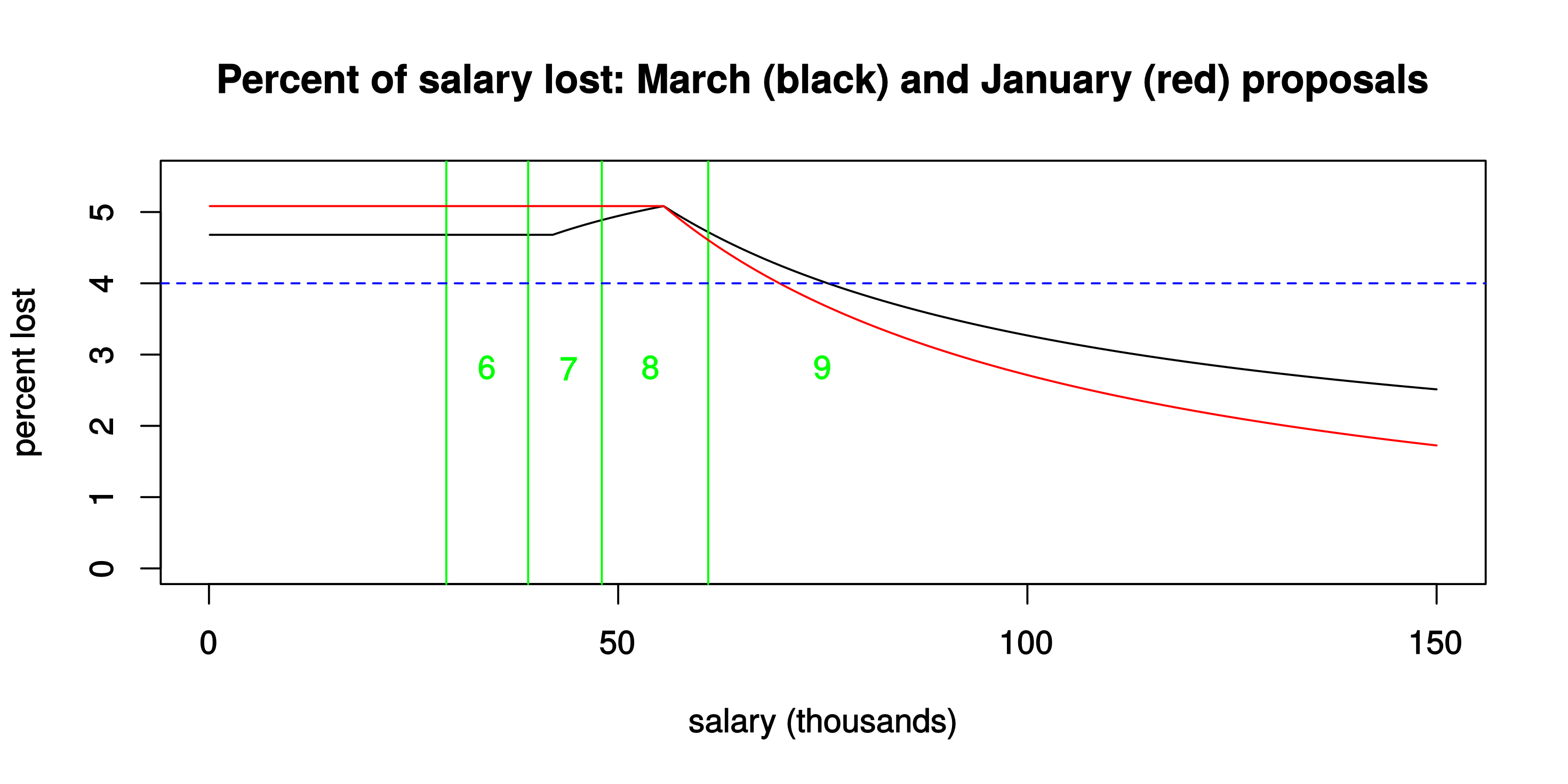
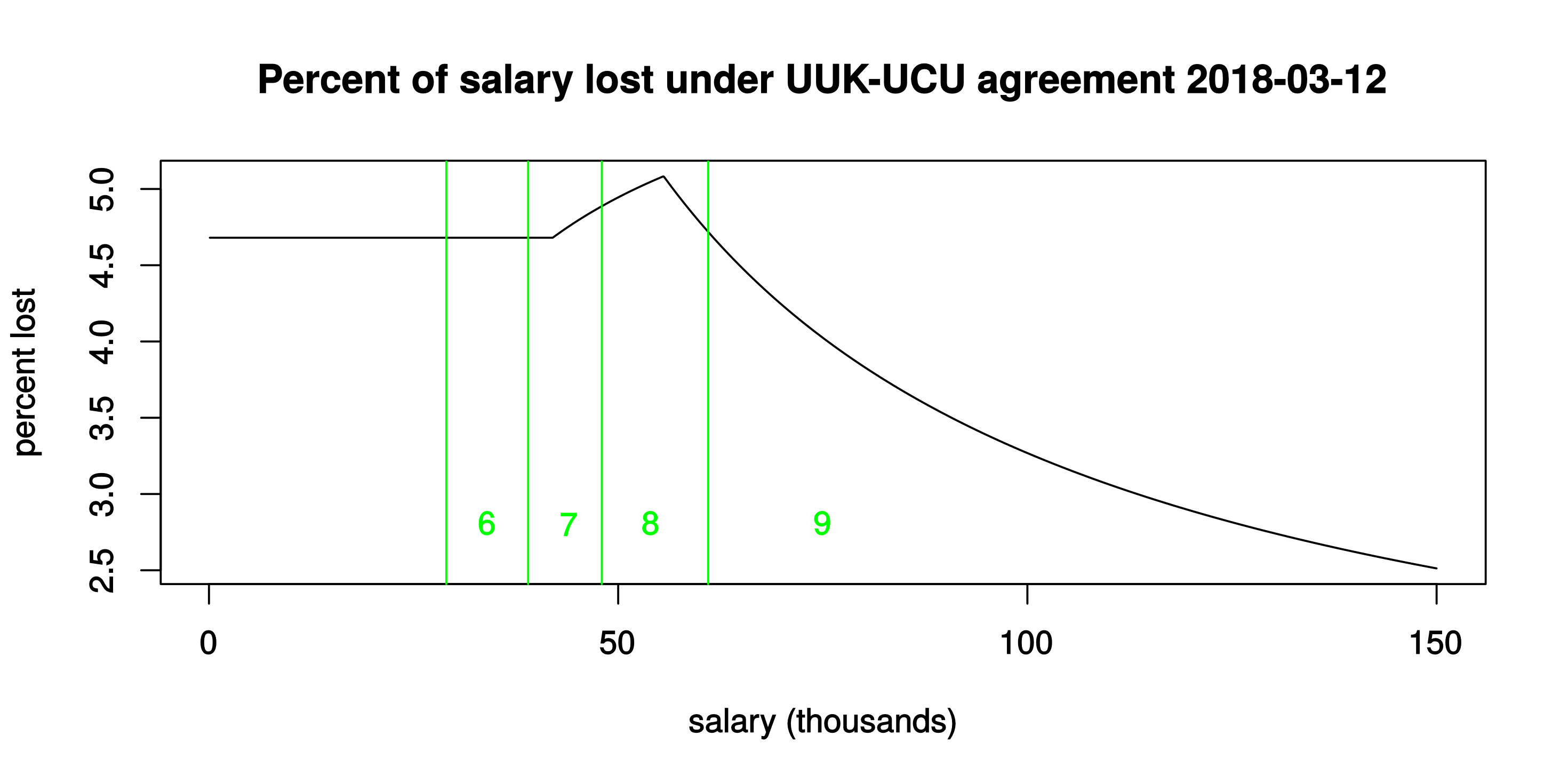
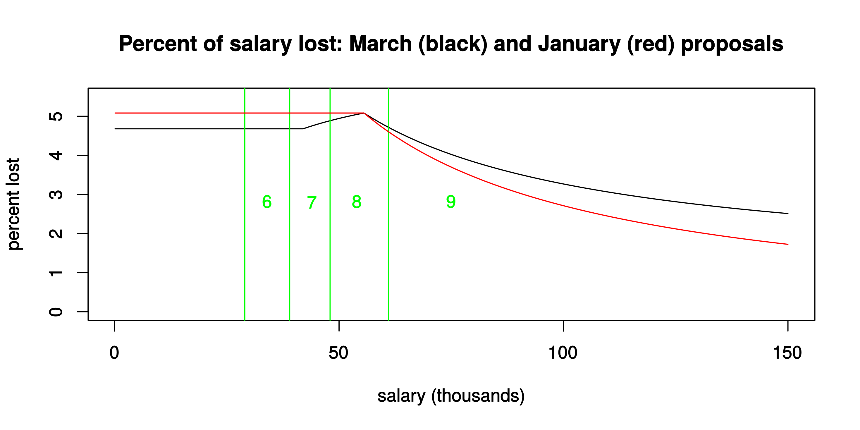
The red curve shows just over 5% effective loss of salary for those below the current £55.55k USS threshold, and then a fairly sharp decline to less than 2% lost at the salaries of the very highest-paid professors, managers and administrators.  Under the January proposals, higher-paid staff would contribute proportionately less to the “rescue package” for USS — less, even, than under the March proposals.  (And if the salary axis were to be extended indefinitely, the <strong>red curve would actually cross the zero-line</strong>: that’s because in the January proposals the defined-contribution rate from employers would actually have <em>increased</em> from (max) 13% to 13.25%.)</p>

<p>In terms of unequal sharing of the “pain”, then, the January proposal was even worse than the March one.</p>

<p>At the bottom here I’ll give the <em>R</em> code and a few words of explanation for the calculation of the red curve above.</p>

<p>But the main topic of this post arises from <strong>a remarkable feature of the above graph!</strong> At the current USS threshold salary of £55.55k, the amount lost is <strong>the same — it’s 5.08% under both proposals</strong>.  Which led me to wonder: is that a <em>coincidence</em>, or was it actually a (pretty weird!) <em>constraint</em> used in the recent UUK-UCU negotiations?  And then to wonder: might the best solution (i.e., for the same cost) be to do <em>something that gives a better graph than <strong>either</strong> of the two proposals seen so far</em>?</p>

<h2 id="tail-wagging-the-dog">Tail wagging the dog?</h2>

<p>The fact that the loss under the March proposal tops out at 5.08%, exactly (to 2 decimals, anyway) the same as in the January proposal, seems unlikely to be a coincidence?</p>

<p>If it’s <em>not</em> a coincidence, then a plausible route to the March proposal, at the UUK-UCU negotiating table, could have been along the lines of:</p>

<blockquote>
  <p>How can we re-work the January proposal to</p>
  <ul>
    <li>retain defined benefit, up to some (presumably reduced) threshold and with some (presumably reduced) accrual rate,</li>
  </ul>

  <p>while at the same time</p>

  <ul>
    <li>
      <p>nobody loses more than the maximum 5.08% that’s in the January proposal</p>
    </li>
    <li>
      <p>the employer contribution rate to the DC pots of high earners is not reduced below the current standard (i.e., without the “match”) level of 12%</p>
    </li>
  </ul>

  <p>?</p>
</blockquote>

<p>Those constraints, coupled with total cost to employers, would lead naturally to a family of solutions indexed by just <em>two adjustable constants</em>, namely</p>

<ul>
  <li>
    <p>the threshold salary up to which DB pension applies (previously £55.55k)</p>
  </li>
  <li>
    <p>the DB accrual rate (previously 1/75)</p>
  </li>
</ul>

<p>— and it seems plausible that the suggested (12 March 2018) new threshold of £42k and accrual rate of 1/85 were simply selected as the preferred candidate (among many such potential solutions) to offer to UUK and UCU members.</p>

<h3 id="but-the-curve-ought-to-be-flat-or-even-increasing">But the curve ought to be flat, or even increasing!</h3>

<p>The two constraints listed as second and third bullets in the above essentially <strong>fix the position of the part of the black curve that applies to salaries over £55.55k</strong>.  That’s what I mean by “tail wagging the dog”.  Those constraints inevitably result in a solution that implies substantial losses for those with low or moderate incomes.</p>

<p>Once this is recognised, it becomes natural to ask: what <strong>should</strong> the shape of that “percentage loss” curve be?</p>

<p>The answer is surely a matter of opinion.</p>

<p>Those wishing to preserve substantial pension contributions at high salary levels, at the expense of those at lower salary levels, would want a curve that decreases to the right — as seen in the above curves for the January and March proposals.</p>

<p>For myself, I would argue the opposite: <strong>The “percent lost” curve should either be roughly constant, or might reasonably even <em>increase</em> as salary increases</strong>.  (The obvious parallel being progressive rates of income tax: those who can afford to pay more, pay more.)</p>

<p>I had made a specific suggestion along these lines, in this earlier post:</p>

<ul>
  <li><a href="/blog/2018/03/01/future-uss-robin-hood-can-help/">Future USS: Robin Hood can help?</a></li>
</ul>

<p>The details of any solution that satisfies the “<strong>percent loss roughly constant, or even increasing</strong>” requirement clearly would need to depend on data that’s not so widely available (mainly, the distribution of all salaries for USS members).</p>

<p>But first the <strong>principle</strong> of fairness needs to be recognised.  And once that is accepted, the constraints underlying future UUK-UCU negotiations would need to change radically — i.e., definitely away from those last two bullets in the above display.</p>

<h2 id="calculation-of-the-red-curve">Calculation of the red curve</h2>

<p>In the previous post I gave R code for the black curve.  Here is the corresponding calculation behind the red curve:</p>

<div class="language-plaintext highlighter-rouge"><div class="highlight"><pre class="highlight"><code>sacrifice.Jan &lt;- function(salary) { # salary in thousands
    old_threshold &lt;- 55.55
    s &lt;- salary

## sacrifice arising from income up to old_threshold
    s2 &lt;- min(s, old_threshold)
    r2 &lt;- s2 * (19/75 + 1/100 - (13.25 + 8)/100)

## sacrifice (max) arising from income over the old threshold
## -- note that this is negative
    r3 &lt;- (s &gt; old_threshold) * (s - old_threshold) * 
                (13 - 13.25)/100

    return(r2 + r3)
}

## A vector of salary values up to £150k
salaries &lt;- (1:1500) / 10

## Compute percent of salary that would be lost, 
## at each salary level
sacrifices &lt;- 100 * sapply(salaries, sacrifice.Jan) / salaries
</code></pre></div></div>

<p>In essence:</p>

<ul>
  <li>salary under £55.55k would lose the defined benefit (that’s the 19/75 part) and the 1% “match”, and in its place would get 21.25% as defined contribution.  The sum of these parts is the computed loss <em>r2</em>.</li>
  <li>salary over £55.55k would <em>gain</em> the difference between potential 13% employer contribution and the proposed new rate of 13.25% (that’s the negative value <em>r3</em> in the code).</li>
</ul>

<hr />

<p><strong>Update, 16 March:</strong> There’s now a follow-up post to this one, which gives more detail on how (mathematically) to achieve a fairer sharing-out of <em>whatever</em> level of USS member pain might ultimately be deemed necessary.  See <a href="/blog/2018/03/16/simple-maths-of-a-fairer-uss-deal/">Simple maths of a fairer USS deal</a> (but ideally only <em>after</em> reading the necessary background, above!).</p>

<hr />

<p>© David Firth, March 2018</p>

<p><strong>To cite this entry:</strong>
Firth, D (2018). USS proposals: Tail wagging the dog? Weblog entry at URL <a href="/blog/2018/03/15/uss-proposals-tail-wagging-the-dog/">https://DavidFirth.github.io/blog/2018/03/15/uss-proposals-tail-wagging-the-dog/</a></p>]]></content><author><name>David Firth</name></author><category term="R" /><category term="Reproducible research" /><category term="UK parochial" /><category term="USS" /><summary type="html"><![CDATA[In response to my previous post, “Latest USS proposal: Who would lose most?”, someone asked me about doing the same calculation for the USS JNC-supported proposals from January.  For a summary of those January proposals and my comments about their fairness, please see my earlier post “USS pension scheme and fairness”.]]></summary></entry><entry><title type="html">Latest USS proposal: Who would lose most?</title><link href="https://davidfirth.github.io/blog/2018/03/13/latest-uss-proposal-who-would-lose-most/" rel="alternate" type="text/html" title="Latest USS proposal: Who would lose most?" /><published>2018-03-13T00:00:00+00:00</published><updated>2018-03-13T00:00:00+00:00</updated><id>https://davidfirth.github.io/blog/2018/03/13/latest-uss-proposal-who-would-lose-most</id><content type="html" xml:base="https://davidfirth.github.io/blog/2018/03/13/latest-uss-proposal-who-would-lose-most/"><![CDATA[<p>Yesterday (March 12th) the UUK/UCU negotiations at ACAS concluded with an <a href="https://www.ucu.org.uk/media/9300/Agreement-reached-between-UCU-and-UUK-under-the-auspices-of-ACAS/pdf/UCU_UUK_agreement_at_ACAS_12_March_Final.pdf">agreement</a> document.</p>

<p>In this post I’ll look at the numbers in those proposed interim changes to the Universities Superannuation Scheme, to work out how much money would effectively be lost by USS members at each salary level.</p>

<p>This is inevitably a fairly rough calculation, but its results don’t really demand more precision.  The picture is very clear: the cost of “saving” USS would be felt most by USS members with low or moderate incomes.</p>

<p>The effective marginal rates at which money is lost by members are (as calculated below):</p>

<ul>
  <li>4.7% on salary up to £42k</li>
  <li>6.3% on salary between £42k and the current USS threshold salary of £55.55k</li>
  <li>1.0% (at most) on salary over £55.55k</li>
</ul>

<p>This translates into the following relationship between salary and the percentage of total salary lost:</p>

<p><img src="/blog/assets/media/2018/03/lost1.png" alt="lost" /></p>

<p>The two “kinks” in that graph reflect the discontinuities in marginal rates, at £42k and at £55.55k.</p>

<p>The vertical lines drawn in green are current full-time pay grades at a typical university (with no London allowance or other extras): grade 6 is the pay of many Research Associates and Teaching Fellows, for example; grade 7 is the pay of most Lecturers; grade 8 is the pay of Senior Lecturers and Readers; and grade 9 is the pay of Professors and other senior staff.  (I have mentioned only academic and research staff here, but the same grades apply also to administrative and technical staff in UK universities.)</p>

<p>The long decay to the right continues indefinitely, ultimately approaching an asymptote at 1% lost, i.e., for those with absolutely stratospheric salaries (if such people are actually members of USS, still, that is — though I would guess that many are not).</p>

<p>In the rest of this post I’ll give the details of the calculation that leads to the above numbers and graph.  (For people who prefer a list of numbers to a graphical display, I have also added the numbers as an Appendix at the bottom of this post.)</p>

<p>Just here, though, let me again comment on how <strong>unfair</strong> this “remedy” would be.  The unfairness should be obvious from the above graph: those who are paid most, and would stand to benefit most from being in USS, would contribute least, in percentage terms, in this proposed move towards the future sustainability of USS.  For a more general view on this unfairness, see also my previous two posts in this “USS” category:</p>

<ul>
  <li><a href="/blog/2018/02/26/uss-pension-scheme-and-fairness/">USS pension scheme and fairness</a></li>
  <li><a href="/blog/2018/03/01/future-uss-robin-hood-can-help/">Future USS: Robin Hood can help?</a></li>
</ul>

<h2 id="the-calculation">The calculation</h2>

<p>It suffices to consider salaries in three distinct bands.  In each salary band, we can calculate how much is lost, per unit of salary.</p>

<p>The following code in <em>R</em> reproduces the graph drawn above.  A brief explanation is then given, beneath the displayed code.</p>

<hr />

<div class="language-plaintext highlighter-rouge"><div class="highlight"><pre class="highlight"><code>## This code runs in base R.

## Function to compute the amount that would be lost annually (£k)
## at any given salary level
sacrifice &lt;- function(salary) { # salary in thousands
    old_threshold &lt;- 55.55
    new_threshold &lt;- 42
    s &lt;- salary

## sacrifice arising from income up to the new threshold
    r1 &lt;- min(s, new_threshold) * ((8.7 - 8)/100 +
                                    19 * (1/75 - 1/85) +
                                    1/100)

## sacrifice arising from income between the thresholds
    s2 &lt;- (s &gt; new_threshold) * (min(s, old_threshold) - 
                                            new_threshold)
    r2 &lt;- s2 * ((8.7 - 8)/100 + (19/75 - (12 + 8.7)/100) + 1/100)

## sacrifice (max) arising from income over the old threshold
    r3 &lt;- (s &gt; old_threshold) * (s - old_threshold) * (1/100)

    return(r1 + r2 + r3)
}

## A vector of salary values up to £150k
salaries &lt;- (1:1500) / 10

## Compute percent of salary that would be lost, 
## at each salary level
sacrifices &lt;- 100 * sapply(salaries, sacrifice) / salaries

## Plot the result
svg(file = "lost.svg", width = 8, height = 4)
plot(salaries, sacrifices, type = "l",
 xlab = "salary (thousands)", ylab = "percent lost",
 main = "Percent of salary lost under UUK-UCU agreement 2018-03-12")
abline(v = c(29, 39, 48, 61), col = "green")
text(x = c(34, 44, 54, 75), y = 2.8,
 labels = c("6", "7", "8", "9"), col = "green")
dev.off()
</code></pre></div></div>

<hr />

<h3 id="band-1-salary-up-to-42k">Band 1: Salary up to £42k</h3>

<p>Most contributions from this part of salary go to the “defined benefit” part of USS. The new proposal would see <strong>8.7%</strong> of member’s salary up to £42k going in to this, as opposed to <strong>8.0%</strong> at present. The return (i.e., the value of the defined-benefit pension) can readily be calculated using the standard HMRC formula, the one that is used for Annual Allowance purposes. Under <em>current USS</em>, the value of this part is <strong>19 times (<em>s</em>/75)</strong>, where <em>s</em> is either £42k or the member’s salary if the salary is less than £42k. Under <em>yesterday’s proposals</em>, the value of this part would fall to <strong>19 times (<em>s</em>/85).</strong> Under yesterday’s proposals, USS members would also lose the possibility to add <strong>1% “matching” employer contribution</strong> to an additional, defined-contribution pension pot. The amount lost to each member, relating to salary in this first band, is then the sum of the additional contribution made and the amount of pension value lost: that is <em>r1</em> in the above code.</p>

<h3 id="band-2-salary-between-42k-and-5555k">Band 2:  Salary between £42k and £55.55k</h3>

<p>Now, for salaries greater than £42k, let <em>s2</em> be the smaller of (salary minus £42k) and (£55.55k minus £42k). Then <em>current USS</em> has members contributing <strong>8% of <em>s2</em></strong> in the defined-benefit part, for a return of <strong>19 times s2/75</strong>. <em>Yesterday’s proposal</em> would change the contribution to <strong>8.7% of <em>s2</em></strong>, for a return of <strong><em>s2</em> times (12% + 8.7%)</strong>. And again, the possibility of <strong>1% matching employer contribution</strong> to the defined-contribution pot would be lost. The amount lost to each member, relating to salary in this second band, is again just the sum of the additional contribution made and the amount of pension value lost: that is <em>r2</em> in the above code.</p>

<h3 id="band-3-salary-over-5555k">Band 3: Salary over £55.55k</h3>

<p>Relating to salary above the current £55.55k threshold, the loss would be limited to <strong>loss of the 1% matching employer contribution</strong>.  This is computed as <em>r3</em> in the above code. (In practice this will be an <em>upper bound</em> on what is lost.  Those USS members with the very highest salaries are likely also to face issues relating to the HMRC Annual Allowance and Lifetime Allowance limits, in which case the loss of the matching employer contribution could be worth substantially less than 1% to them.)</p>

<h2 id="conclusion">Conclusion</h2>

<p>I have reproduced the full calculation here, with code, because I found the result of the calculation so shocking!  If anyone reading this thinks I have made a mistake in the calculation, please do let me know. If it <strong>is</strong> correct — and right now I have no reason to suspect otherwise — then I confess I’m alarmed that this is actually being proposed as a potential solution, even as an <em>interim</em> solution for the next 3 years, to the perceived problems with USS.  It shakes my faith in those who have been involved in negotiating it.  With seemingly intelligent people on both sides of the table, how could they possibly come up with something as bad as this?</p>

<hr />

<p><strong>Update, 14 March:</strong> Some details in the original post yesterday were not quite right, and so the graph/numbers that appear in the now-corrected version above are different in detail from yesterday’s.  But the overall picture is unchanged.  (If you really want to know about those changes in detail, please see my note in Appendix 2 at the bottom of the post about that.)</p>

<hr />

<p><strong>Update, 16 March:</strong> After reading this post, you might perhaps be interested in these follow-ups:</p>

<ul>
  <li><a href="/blog/2018/03/15/uss-proposals-tail-wagging-the-dog/">USS proposals: Tail wagging the dog?</a></li>
  <li><a href="/blog/2018/03/16/simple-maths-of-a-fairer-uss-deal/">Simple maths of a fairer USS deal</a></li>
</ul>

<hr />

<p>© David Firth, March 2018</p>

<p><strong>To cite this entry:</strong> Firth, D (2018). Latest USS proposal: Who would lose most?  Weblog entry at URL 
<a href="/blog/2018/03/13/latest-uss-proposal-who-would-lose-most/">https://DavidFirth.github.io/blog/2018/03/13/latest-uss-proposal-who-would-lose-most/</a>.</p>

<hr />

<h3 id="appendix-1-a-tabular-view-of-whats-in-the-graph">Appendix 1: A tabular view of what’s in the graph</h3>

<div class="language-plaintext highlighter-rouge"><div class="highlight"><pre class="highlight"><code>## Make a table for anyone who wants more detail than the graph
salary &lt;- c(10:55, 55.55, 56:100, 150)
percent_lost &lt;- round(100 * sapply(salary, sacrifice) / salary, 2)
salary &lt;- 1000 * salary
my_table &lt;- data.frame(salary, percent_lost)
</code></pre></div></div>

<p>That’s the code for making a little table, showing the same numbers as those in the above graph.</p>

<p>Here is the resulting table:</p>

<div class="language-plaintext highlighter-rouge"><div class="highlight"><pre class="highlight"><code>salary    %
 10000 4.68 -- I started the table at £10k for no good reason
 11000 4.68
 ...
 41000 4.68
 42000 4.68 -- the proposed new threshold
 43000 4.72
 44000 4.76
 45000 4.79
 46000 4.82
 47000 4.86
 48000 4.89
 49000 4.92
 50000 4.94
 51000 4.97
 52000 5.00
 53000 5.02
 54000 5.05
 55000 5.07
 55550 5.08 -- current USS threshold, highest % of salary lost
 56000 5.05
 57000 4.98
 58000 4.91
 59000 4.84
 60000 4.78
 61000 4.72
 62000 4.66
 63000 4.60
 64000 4.54
 65000 4.49
 66000 4.44
 67000 4.39
 68000 4.34
 69000 4.29
 70000 4.24
 71000 4.19
 72000 4.15
 73000 4.11
 74000 4.07
 75000 4.02
 76000 3.98
 77000 3.95
 78000 3.91
 79000 3.87
 80000 3.84
 81000 3.80
 82000 3.77
 83000 3.73
 84000 3.70
 85000 3.67
 86000 3.64
 87000 3.61
 88000 3.58
 89000 3.55
 90000 3.52
 91000 3.49
 92000 3.47
 93000 3.44
 94000 3.41
 95000 3.39
 96000 3.36
 97000 3.34
 98000 3.31
 99000 3.29
100000 3.27
150000 2.51 -- possibly there are even some salaries this high?!
</code></pre></div></div>

<hr />

<h3 id="appendix-2-details-of-the-update-made-on-14-march">Appendix 2: Details of the update made on 14 March</h3>

<p><strong><em>Many thanks</em></strong> to all who gave feedback on the original posting, yesterday (13 March).</p>

<p>In response to that feedback, I made two substantive changes to the calculation.  This Appendix gives details of those changes, for those who are interested (and for the record).</p>

<p>Neither change affects the story qualitatively: only the detailed numbers have changed a bit.</p>

<h4 id="change-1-use-of-hmrc-multiplier-19-rather-than-23">Change 1: Use of HMRC multiplier 19 rather than 23</h4>

<p>The HMRC calculations for <em>Annual Allowance</em> and <em>Lifetime Allowance</em> purposes are different in detail: the former uses a multiplier of 19 times pension to value USS defined benefits, while the latter uses 23 (i.e., in place of 19).  In yesterday’s post I had used 23.  <strong>The updated figures calculated above use multiplier 19 **instead</strong>.**</p>

<p>Mainly I decided to use the smaller figure as it’s a bit more conservative, in relation to the value lost through the proposed reduction of defined benefits.  (I certainly don’t want to be accused of bias in the other direction, through having picked the larger multiplier.)</p>

<p>The effect on the calculated numbers is mainly to reduce the height of the “spike” that appears in the graph, around the £55k salary level.  The spike is still there; it’s just a bit smaller.</p>

<p>My friend Jon commented that the <em>actual</em> value of a defined-benefit pension is harder to quantify than the HMRC formula would suggest — and that it’s likely to be dependent on age and perhaps other factors.  This is undoubtedly true, and certainly <strong>I would not suggest that anyone should use the above numbers for their own financial planning!</strong>  Rather, the aim here was (only) to show through a simple, transparent calculation how the losses arising from current proposals would differ — in rough, average terms — between pay levels.</p>

<p>Since writing my post yesterday I found that I am not alone in having done a calculation like this: see also <a href="http://brianosmith.blogspot.co.uk/">http://brianosmith.blogspot.co.uk/</a> (and maybe there are others too?).</p>

<p><strong>Change 2: Inclusion of the USS “Match” at all salary levels</strong></p>

<p>Several people pointed out to me that the USS “Match” possibility is available at all salary levels.  So it’s a benefit that would be <em>lost</em> at all salary levels, under the 12 March agreement.  In yesterday’s post I had taken it into account only at salaries over £55.55k: that (relatively minor) error is now corrected, in the revised figures shown above.</p>

<hr />]]></content><author><name>David Firth</name></author><category term="R" /><category term="Reproducible research" /><category term="UK parochial" /><category term="USS" /><summary type="html"><![CDATA[Yesterday (March 12th) the UUK/UCU negotiations at ACAS concluded with an agreement document.]]></summary></entry></feed>